
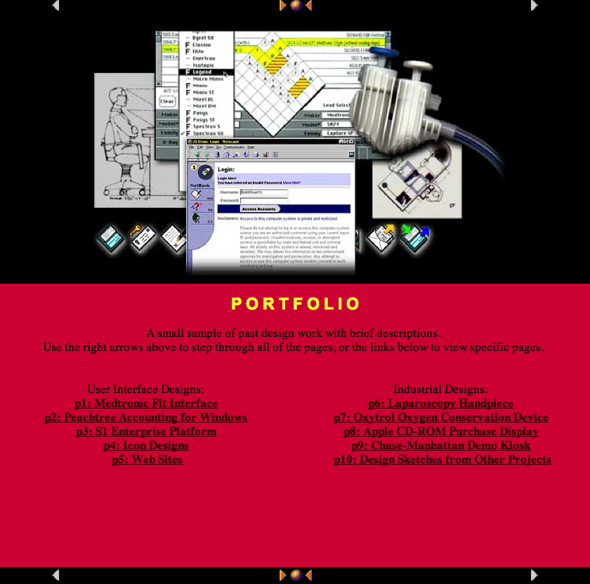
Design Portfolio: Phillip Randolph Carter
It's incredible to work across many products, organizations, and industries. Each new opportunity challenges us to discard assumptions and learn new language, technology, and requirements. In the information age we can never stop learning... because everything touches other people, teams, and organizations.
(click on any thumbnail to open a full-size slide viewer)
"Randy has a really broad knowledge base,
but that doesn't prevent him from being
an expert on software design...
and design in general.
...[he] uses his immense capacity for idea generation to
nudge every group in a customer-centric direction."
Zach Franzen - Marketer, illustrator, collaborator
Interactive Intelligence and Genesys - Product Marketing: 2014 to 2021
2015 PureCloud became their lead offer and rapidly started to grow market share - moving from UX into Product Marketing I found a new career.
Late 2016 Interactive Intelligence was bought by Genesys, a CX software competitor
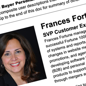

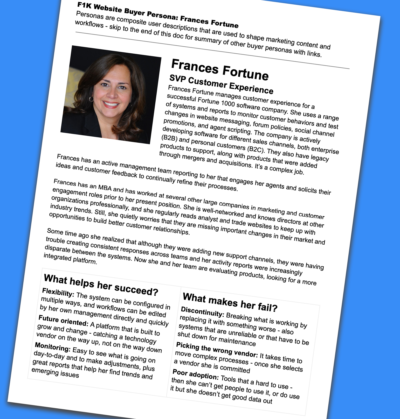
PDF of one of 6 website buyer personas derived from PureCloud UX work.
Personas are extremely useful for making design decisions and helping team members understand customers and users. They are a composite users that represent important needs, with perspectives and history to make them feel like real people.
(PDF from Google Doc, also hosted on WordPress intranet and powerpoint training decks)
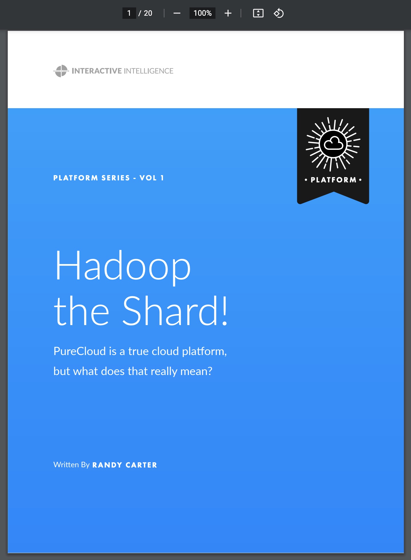
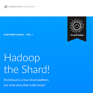
eBook "Hadoop the Shard!" was written to explain cloud concepts to contacte center business users, while also opening a conversation on our cloud architecture for technical readers.
(PDF eBook for marketing lead generation)

90-second animation on AI adoption in contact centers, based on an interview converted to narration and external content.
(Animated video hosted on YouTube)
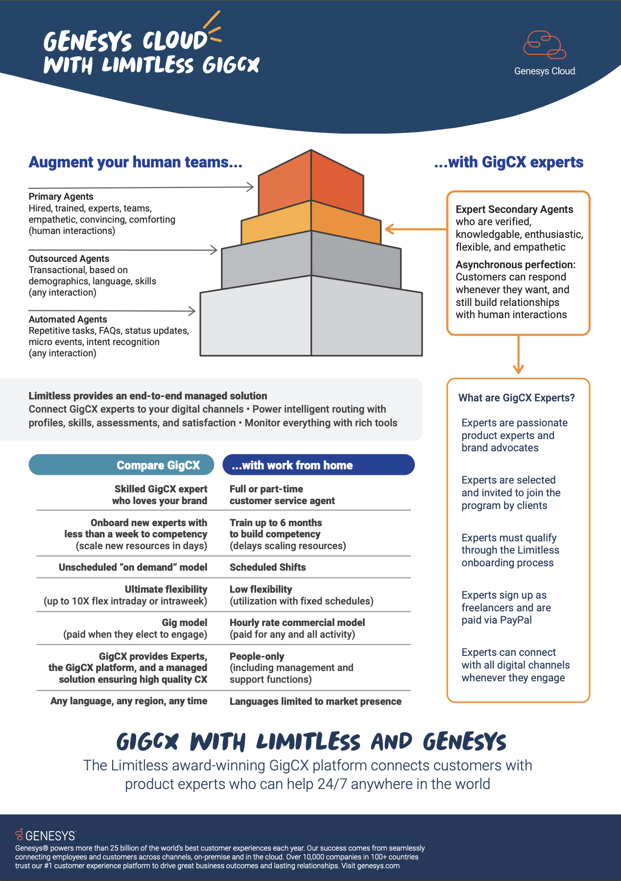
PDF Datasheet: Limitless GigCX, companion to conference event announcing a new partnership.
- Strategic Focus:
- Portfolio differentiation strategy and content, cloud education, contrainer messaging, and developer outreach
- Go-to-market (GTM) for Genesys products,
plus Google, AWS, Zoom, and other partners - Marketing and customer personas, with UX coordination
- NPS (Net Promoter Score) biannual analysis and recommendations for CEO
- Planning, content and speaking at conferences, partner events, sales training with enablement materials
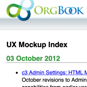
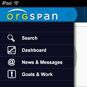
OrgSpan and Interactive Intelligence - UX Architect: 2012 to 2014
Orgspan was founded to build cloud tools for organizations that would connect to other work management apps - and roll up work into corporate goal feedback from those systems.
Along the way we built a scalable cloud enterprise communications platform with rich hierarchy and groups you could build manually, or with rules. This quickly led to a buyout from Interactive Intelligence.
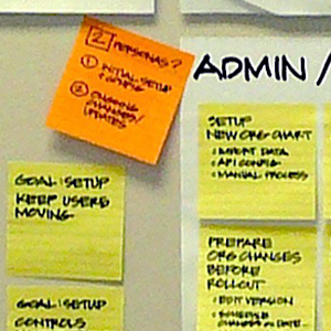
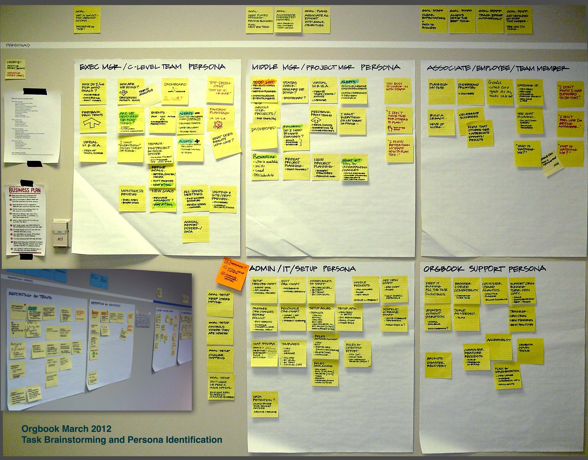
Taking advantage of growth space in our office, we did structured brainstorming on tasks and personas as a team.
(Sticky notes, tape, markers, with stickers for voting)
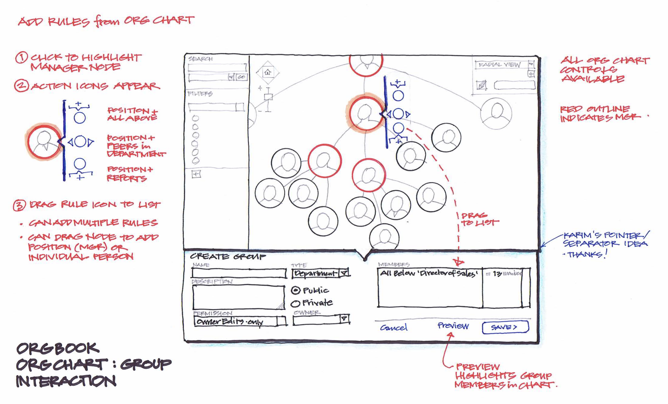
Hierarchy views and rules for creating dynamic groups.
We could derive the hierarchy of a company from Active Directory permissions exports, but work assignments often don't fit organizations cleanly - projects need additional resources and skills from other teams. 'Groups' was our solution to apply projects to teams, and we patented a new method for defining groups with rules around people.
(Ink and colored pencil sketches)
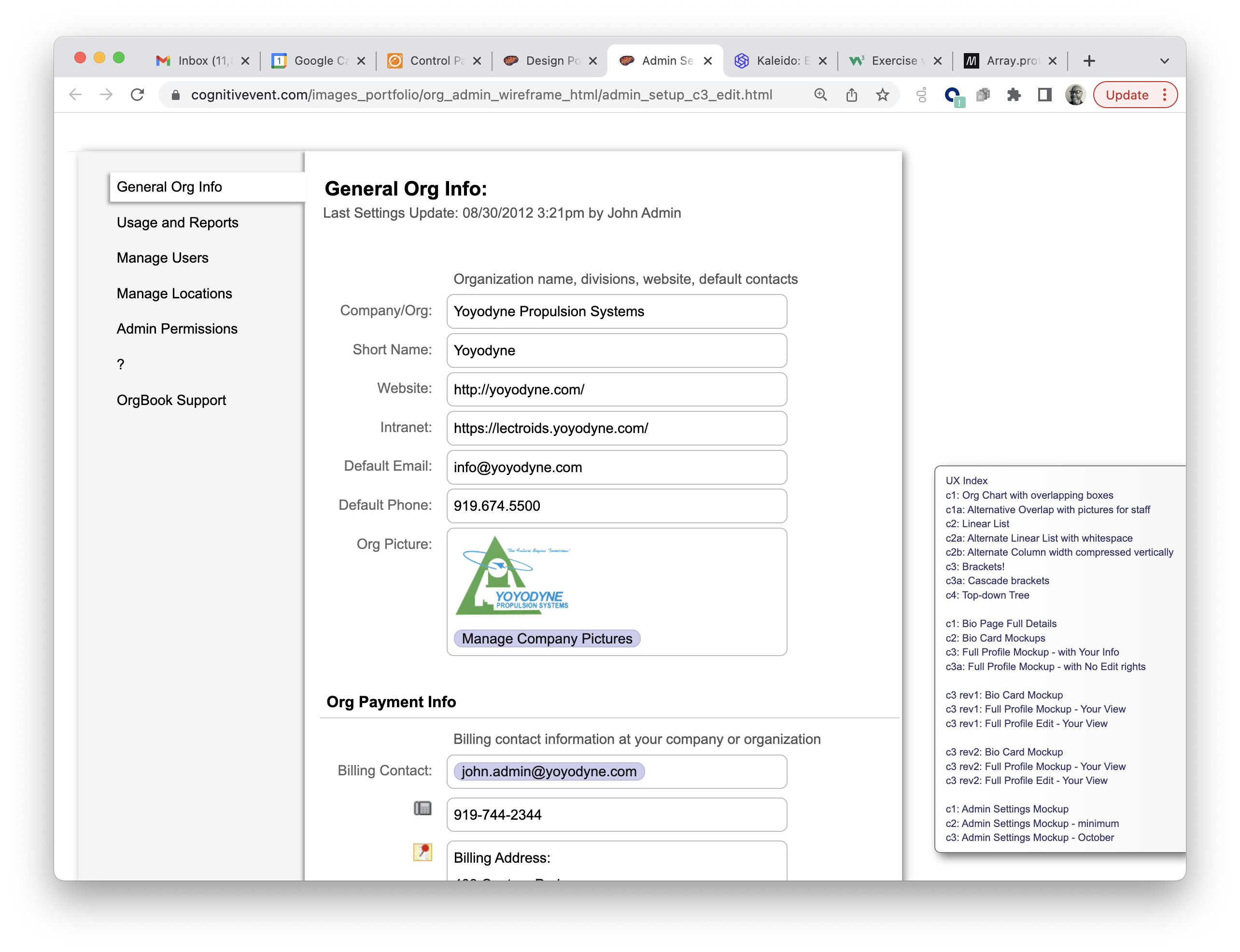
Interactive HTML for usability testing admin functions and navigation.
(HTML mockup - one of many versions)
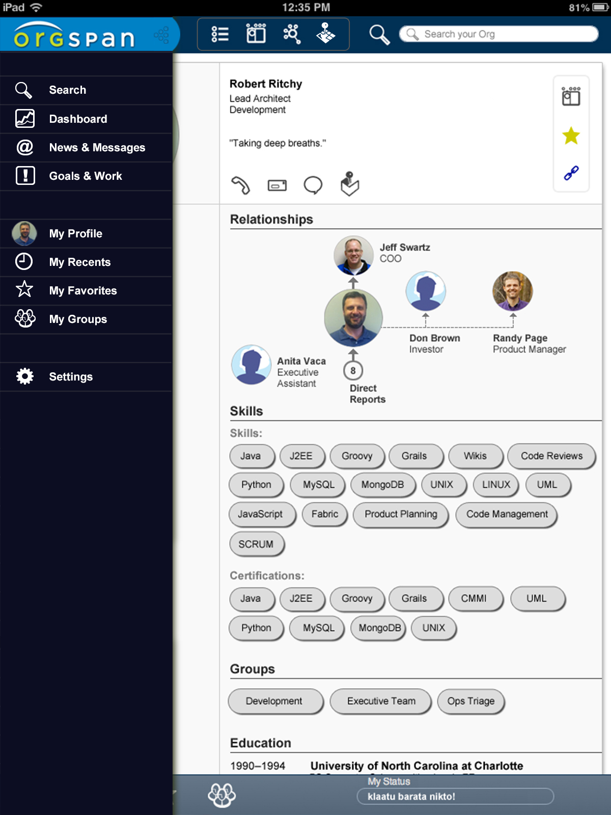
Simultaneous development of browser, Android, and iOS mobile applications - a refined mockup for our iOS programmer.
(Photoshop mockup for requirements)
- Strategic Focus:
- Personas, task analysis and mapping, agile planning with team
- UX Design: Web, iOS, and Android designs; hierarchy selection rules and designs; admin, permissions, and integrations; XMPP-compliant web chat designs
- Usability testing and analysis
WebAssign - Director UX: 2010 to 2012
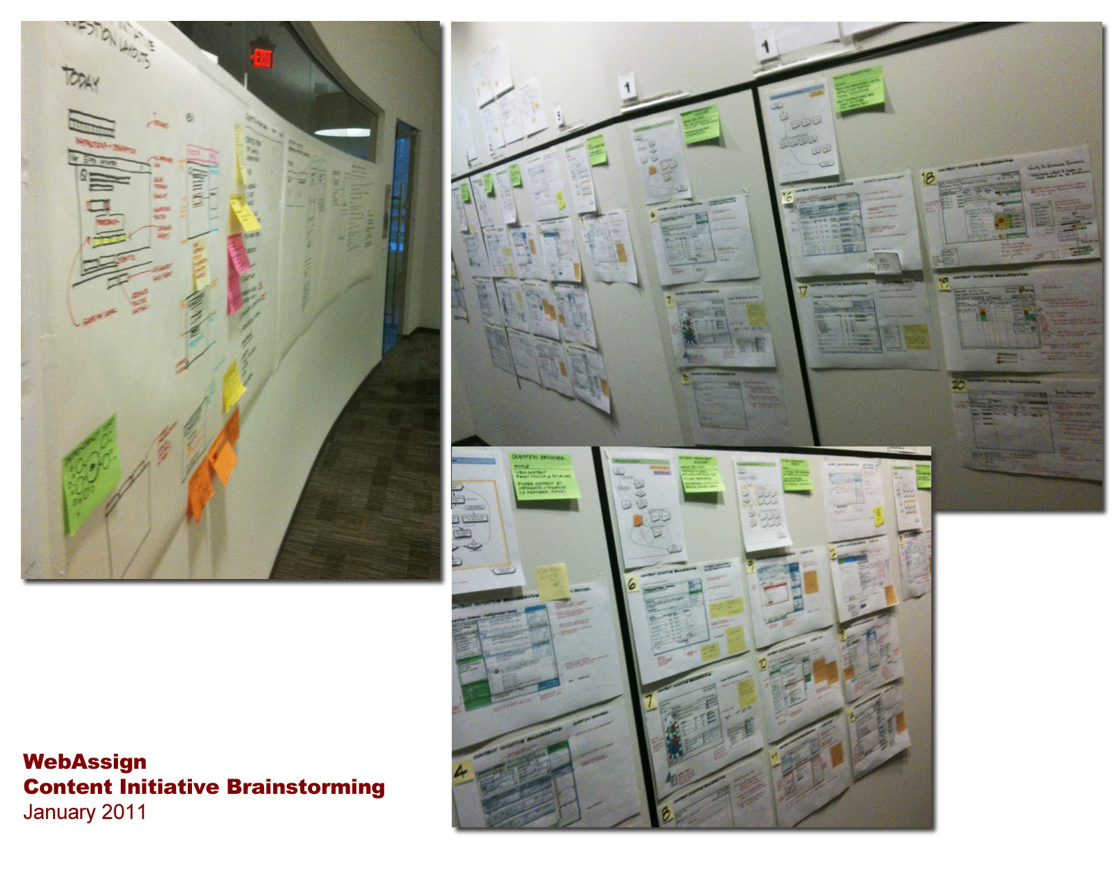
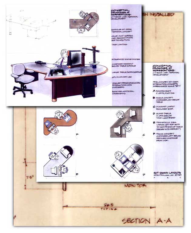
Part of design thinking stakeholder facilitation workshops on new content development.
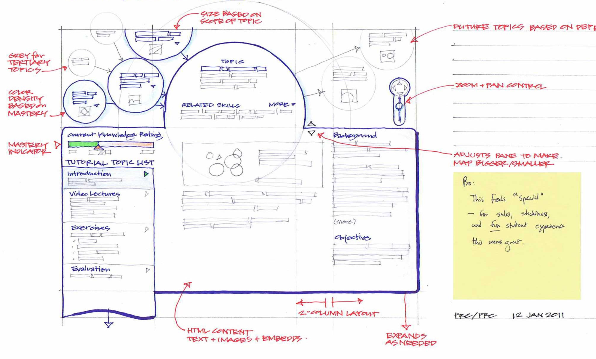
(below) Concept for new tutorial system
One of the favored designs from the workshop was this 'knowledge tree' idea that mapped dependencies for concepts in bubble nodes for navigation.
(Ink and colored pencils)
One of the favored designs from the workshop was this 'knowledge tree' idea that mapped dependencies for concepts in bubble nodes for navigation.
(Ink and colored pencils)
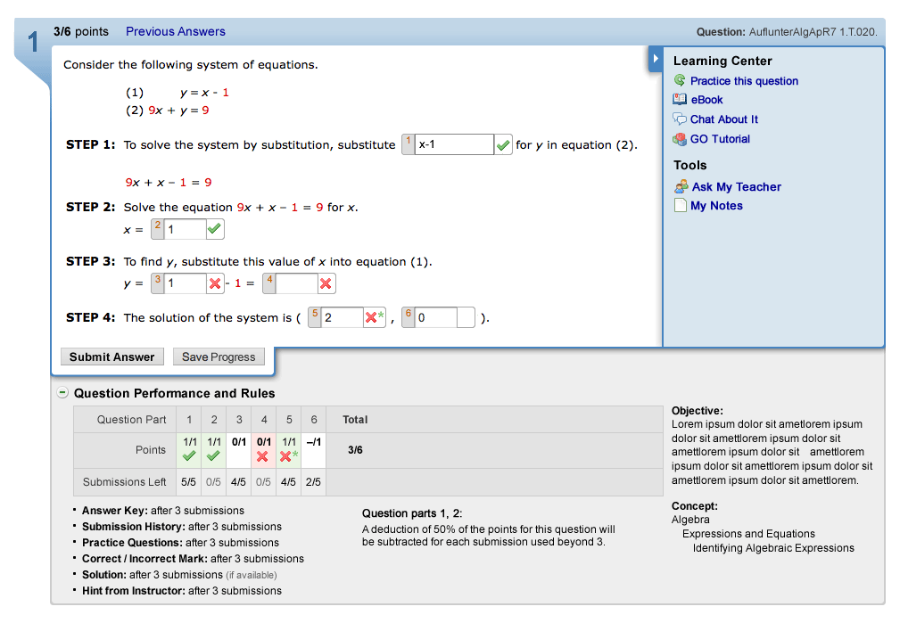
Part of a series of sketches for future directions at WebAssign. Next slide shows development of online version...
(Ink and colored pencils)
Further development of question wrapper in a wireframe by UX designer under direction. Previous slide shows initial concept sketch.
(Fireworks on Mac)
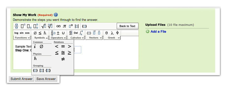
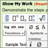
Math equation editor tool
(top) Math symbols menu
Built in HTML5 by an outside contractor by extending the DIJIT text editor; the equation mode shown was one of several tool extensions planned for different academic disciplines. Common tools are loaded on the top row.
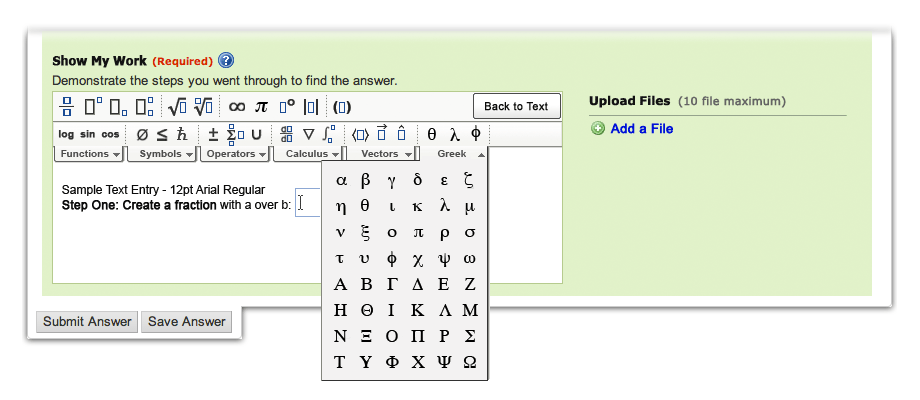
(bottom) Greek symbols menu
Specialized symbols are on rollover tabs that extend down, with popular functions from those tabs available in the second row - these symbols are working (and repeated) buttons for quick access that also provide users with scent to the contents of the hidden functions.
(Photoshop on Mac)
Specialized symbols are on rollover tabs that extend down, with popular functions from those tabs available in the second row - these symbols are working (and repeated) buttons for quick access that also provide users with scent to the contents of the hidden functions.
(Photoshop on Mac)
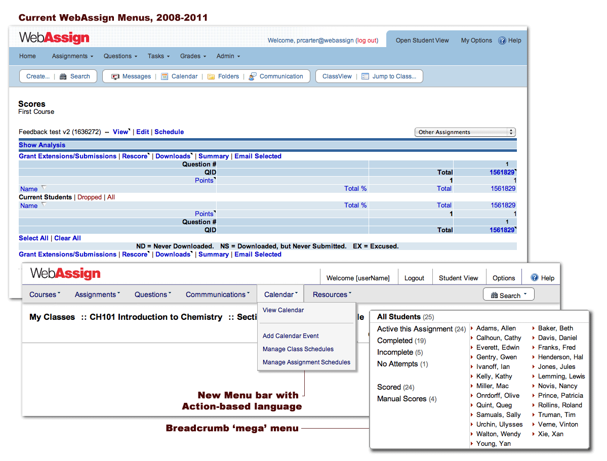
Hierarchical breadcrumb headline - One of several quick variations exploring simplifying nav menus and reducing the number of different legacy views in the product.
(HTML/JS/CSS mockup)
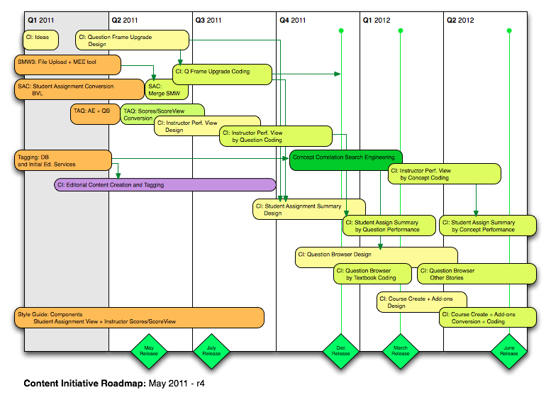
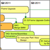
Roadmap and release dates with color coding - yellow for UX design, green for development coding, dark green for development architecture.
(Omnigraffle on Mac)
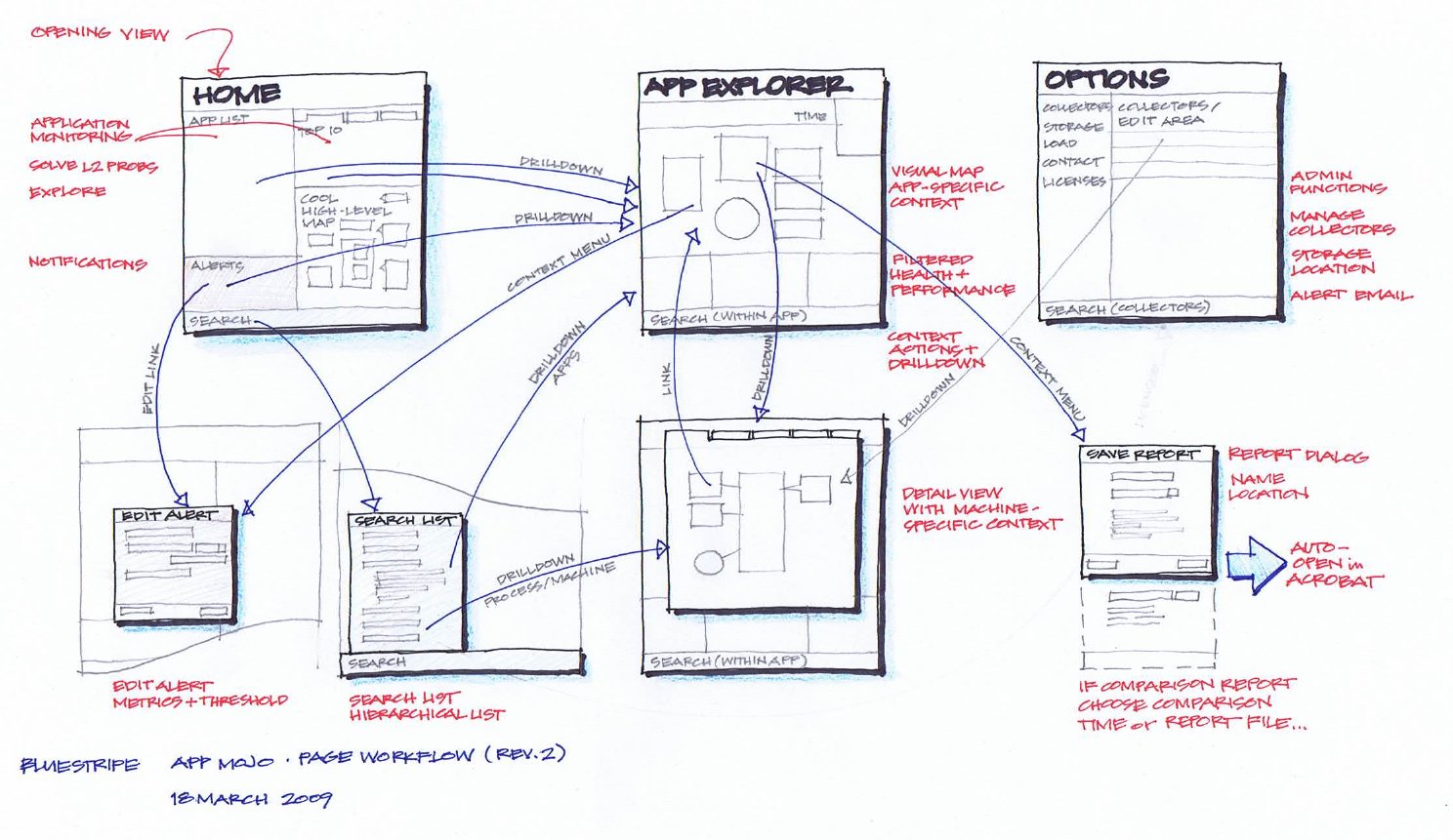
BlueStripe - Product Designer: 2008 to 2010
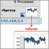

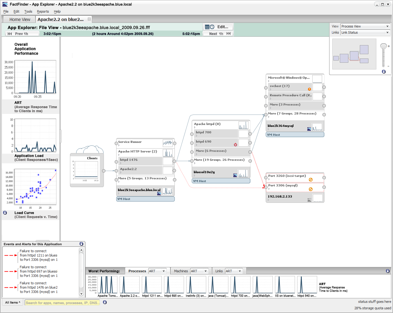
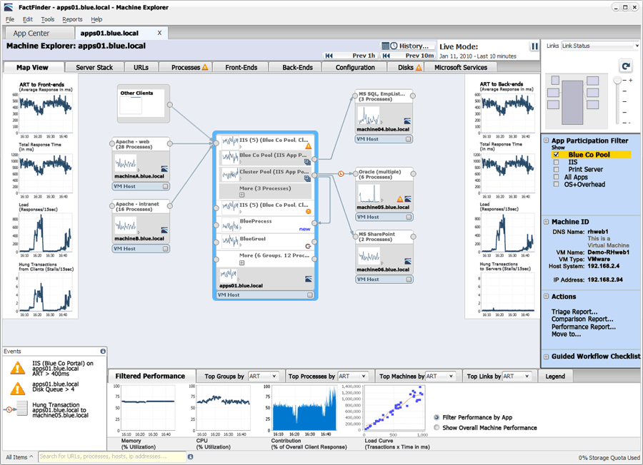
Shows related processes linked across multiple machines or virtual machines, useful for triage of a multi-tier distributed app.
Sparkline graphs show response time performance with drilldown for more detail.
(below) Map highlighting concept
In a triage process when a user zooms out they need to quickly find areas for attention - we evaluated many different indicators to build a consistent design language.
Small icons on the machines indicate OS and whether there is a BlueStripe 'collector' installed.
(Photoshop mockup for requirements)
In a triage process when a user zooms out they need to quickly find areas for attention - we evaluated many different indicators to build a consistent design language.
Small icons on the machines indicate OS and whether there is a BlueStripe 'collector' installed.
(Photoshop mockup for user tests)
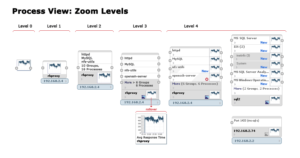
Applications and networks are wildly variable and views could needed as much useful information as possible - this mockups was used to build the dynamic changes for different levels.
Part of a series of refined variations to define a simpler visual vocabulary for zoom.
Sparkline graphs show response time performance with drilldown for more detail.
(Photoshop mockup for requirements)
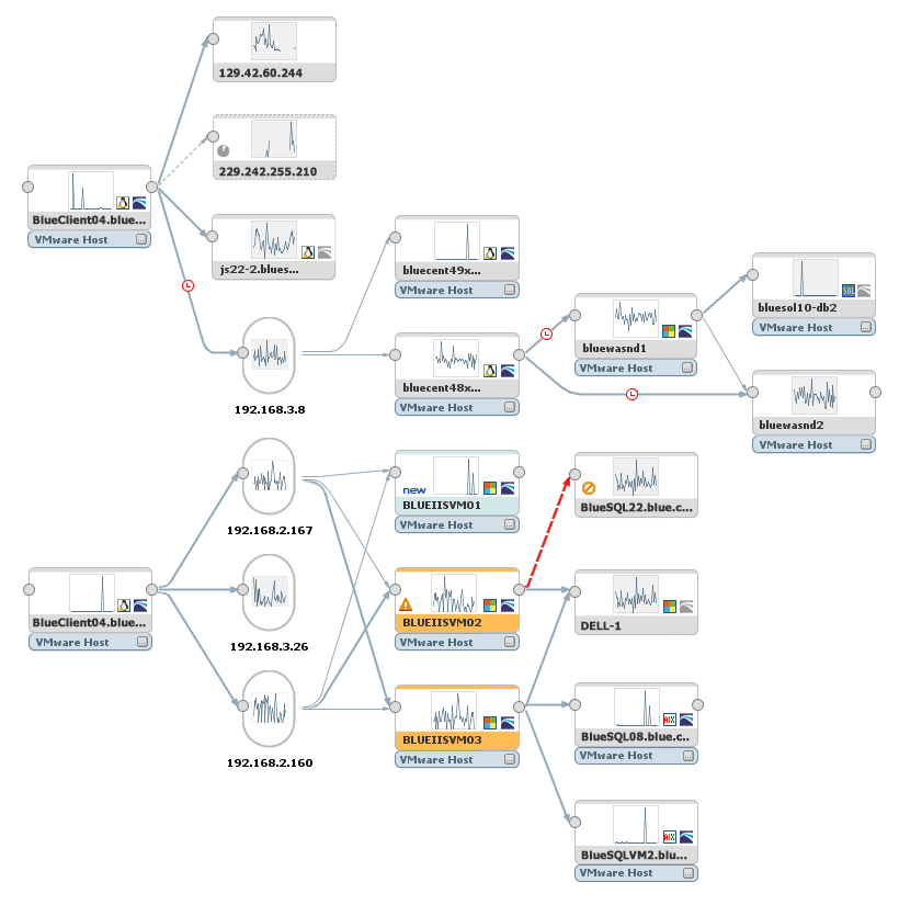
Shows participation in all applications by a single machine (the inverse of Application Explorer) helps users diagnose health issues with a troublesome node.
Large graphs on left and right show performance in and out of the processes, and tabs along the top show additional details.
(Photoshop mockup for requirements)
Shows user journeys for common scenarios.
This view was popular with developers and product management for feature discussions and persona analysis.
(Ink and colored pencils)
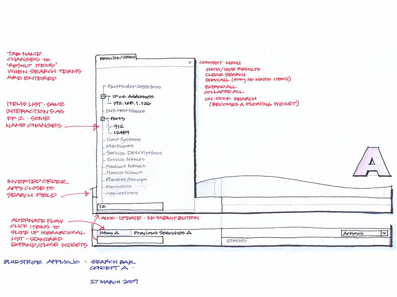
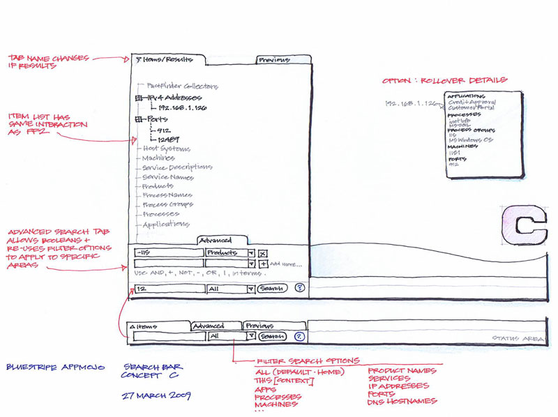
Concept A: filtered tree view
Similar to existing BlueStripe search at the time, with improved visibility and labels.
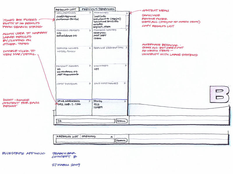
Concept B: grid with categories
Clicking lines in the cells applies additional filters to narrow results.
Concept C: hybrid tree view
Builds on tree view from concept A, but allows the user to add explicit rules with dynamic form fields.
(Ink and colored pencils)
Clicking lines in the cells applies additional filters to narrow results.
(Ink and colored pencils)
Builds on tree view from concept A, but allows the user to add explicit rules with dynamic form fields.
(Ink and colored pencils)
Lulu Press - Director UX: 2007 to 2008
As director of a team of UX talent, my focus was on strategy, stakeholder collaboration, agile planning, and frequent user testing. Collaboration with stakeholders was usually done through sketching, for faster alternative ideas and better feedback.
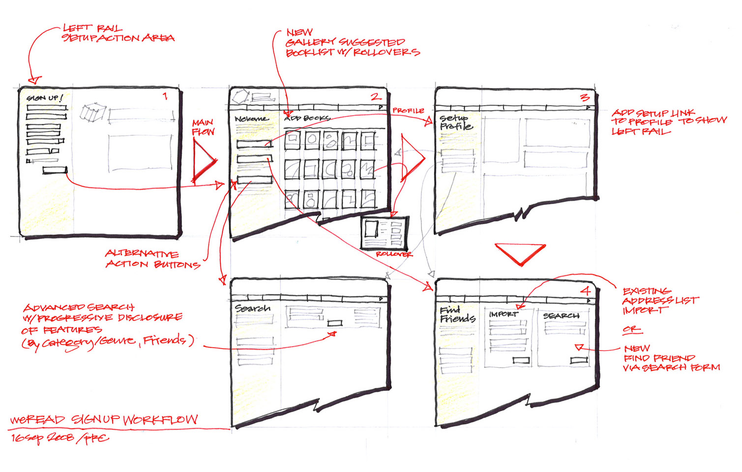
From collaborative session with weRead CEO, showing paths through the alternative feature appeals.
weRead was a Facebook app company purchased by Lulu in 2007.
(Ink and colored pencils)
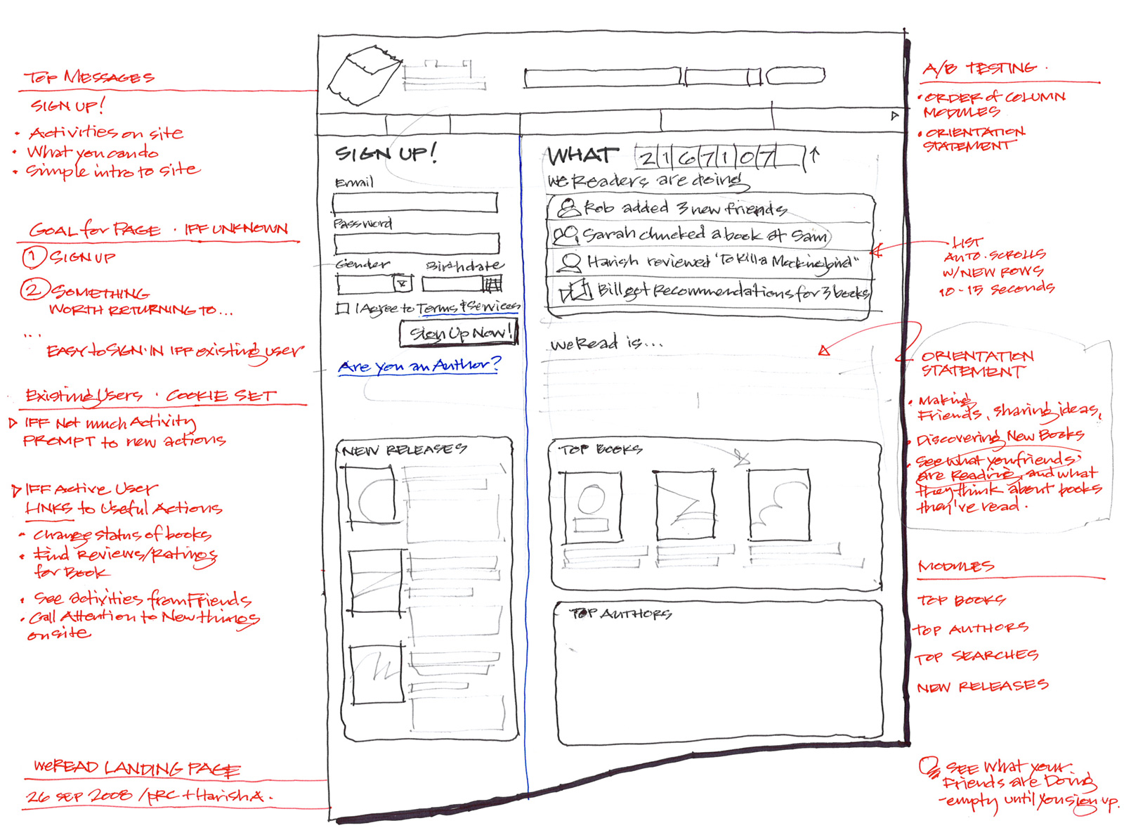
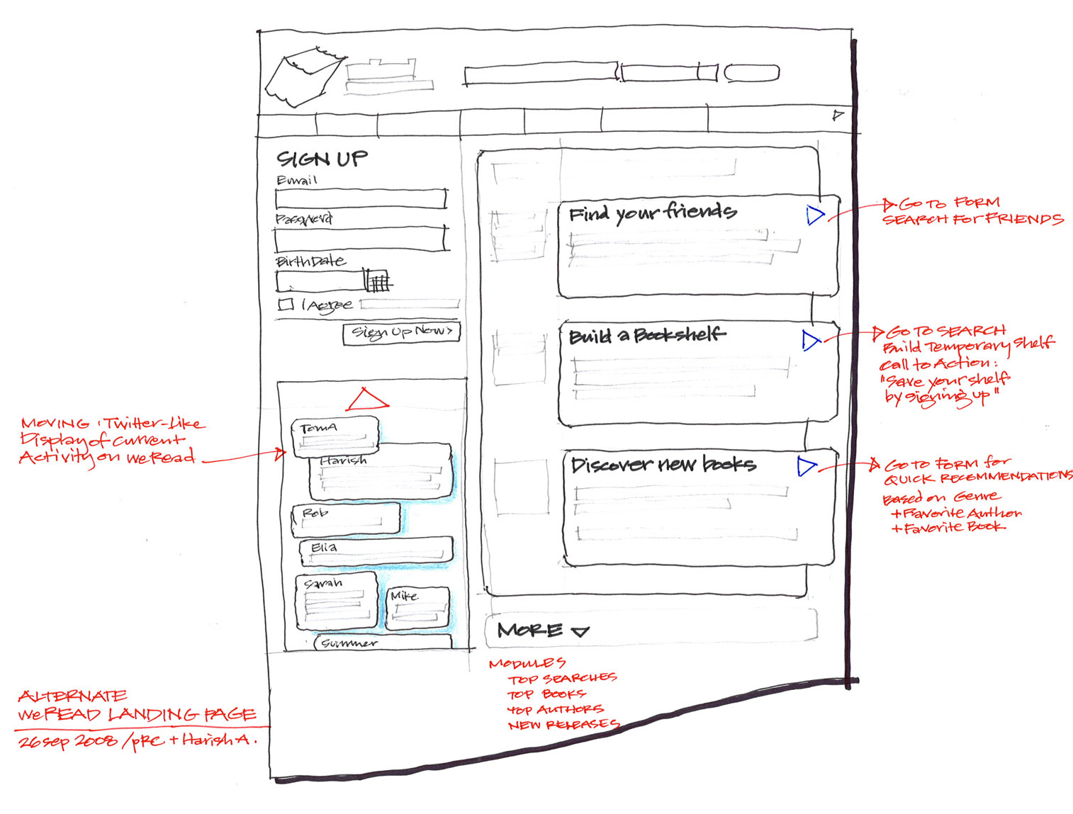
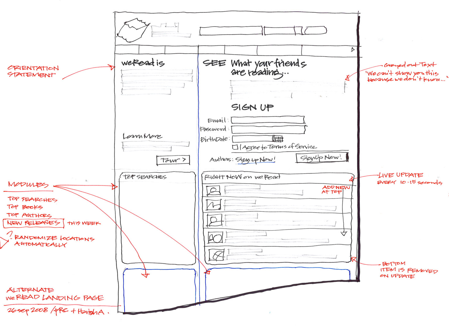
Part of series of collaborative sketches produced with CEO in a 2-day meeting to explore alternate workflows and page designs for signup and library functions.
These concepts led to marketing mockups for the landing pages and specs for interaction improvements.
weRead Landing Page: Alternative 2
Moving timeline of bubbles showing live activity on left.
weRead Landing Page: Alternative 3
Fear of missing out - What are your friends reading?
(Ink and colored pencils)
Moving timeline of bubbles showing live activity on left.
(Ink and colored pencils)
Fear of missing out - What are your friends reading?
(Ink and colored pencils)
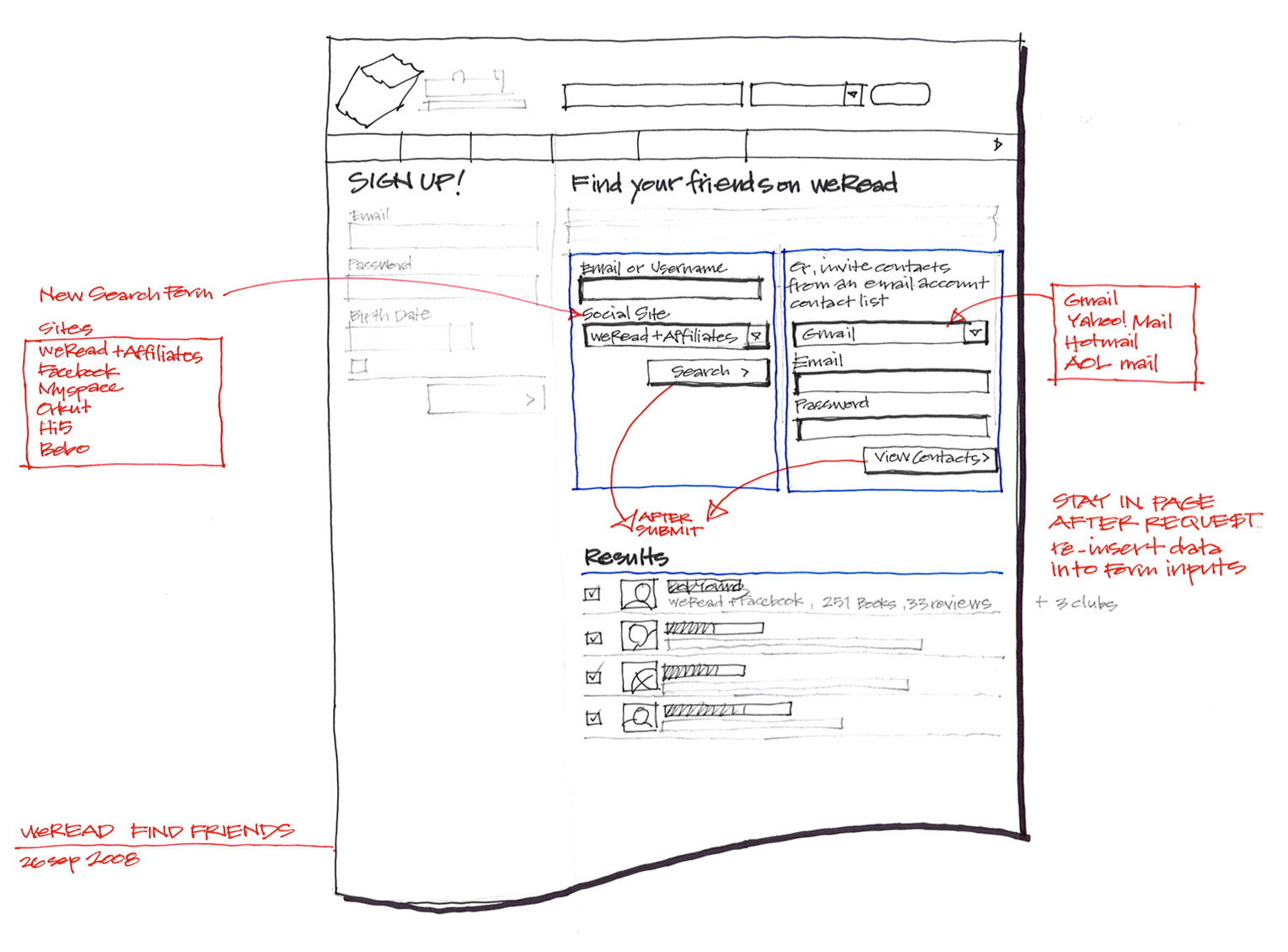
Alternative - Find your friends on weRead.
(Ink and colored pencils)
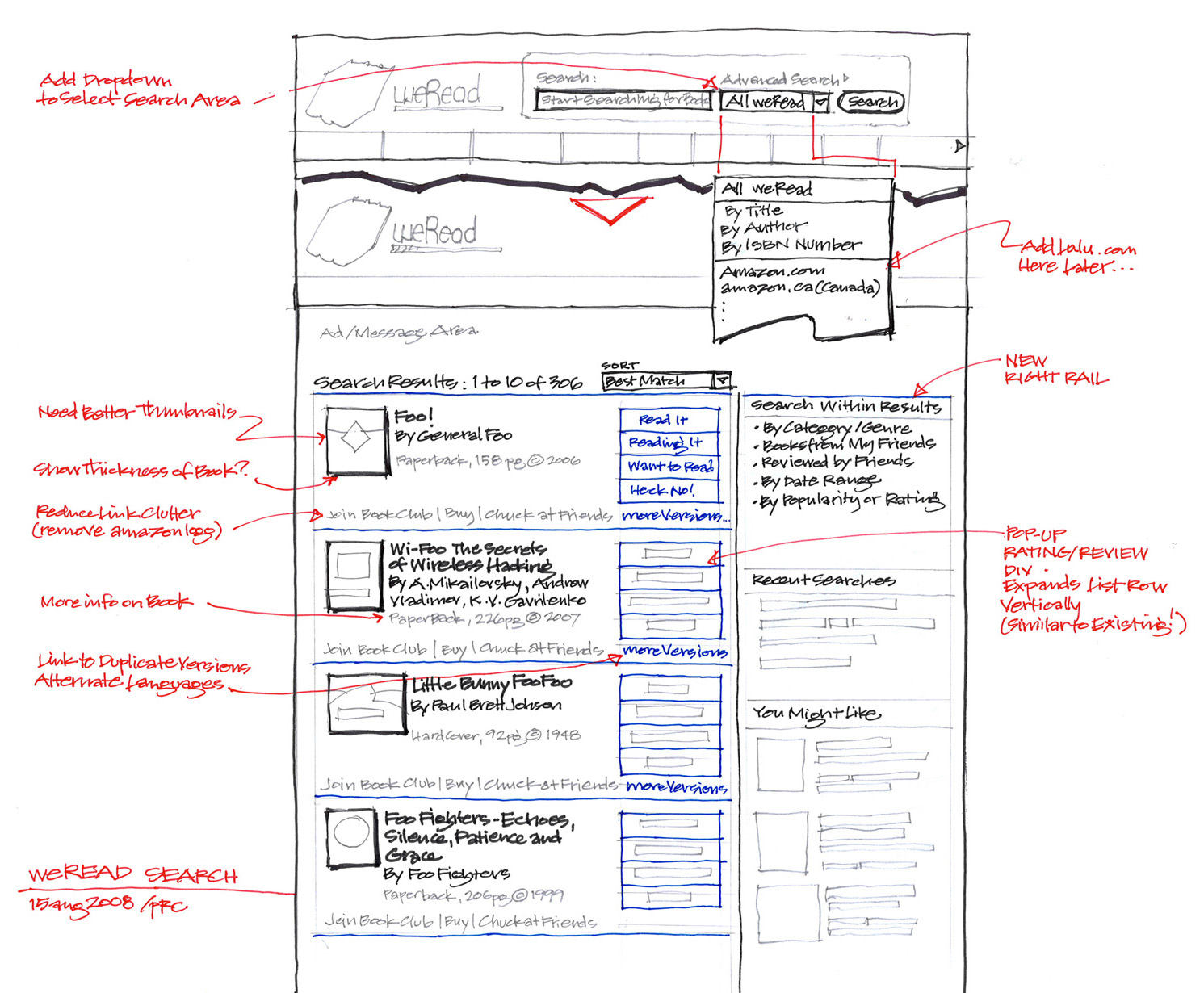

Improved search and results.
weRead Feature Pitch: Book Details
Detail view for a book from search.
weRead Feature Pitch: Friends
Alternative - Find your friends on weRead.
(Ink and colored pencils)
Detail view for a book from search.
(Ink and colored pencils)
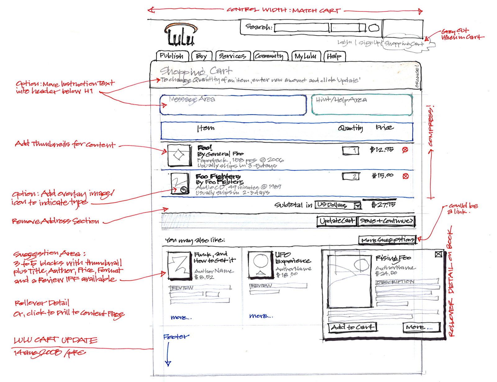
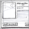
Ever-popular, ongoing cart re-designs!
Concept adds feed of related books as suggestions along the bottom, with rollover details.
(Ink and colored pencils)
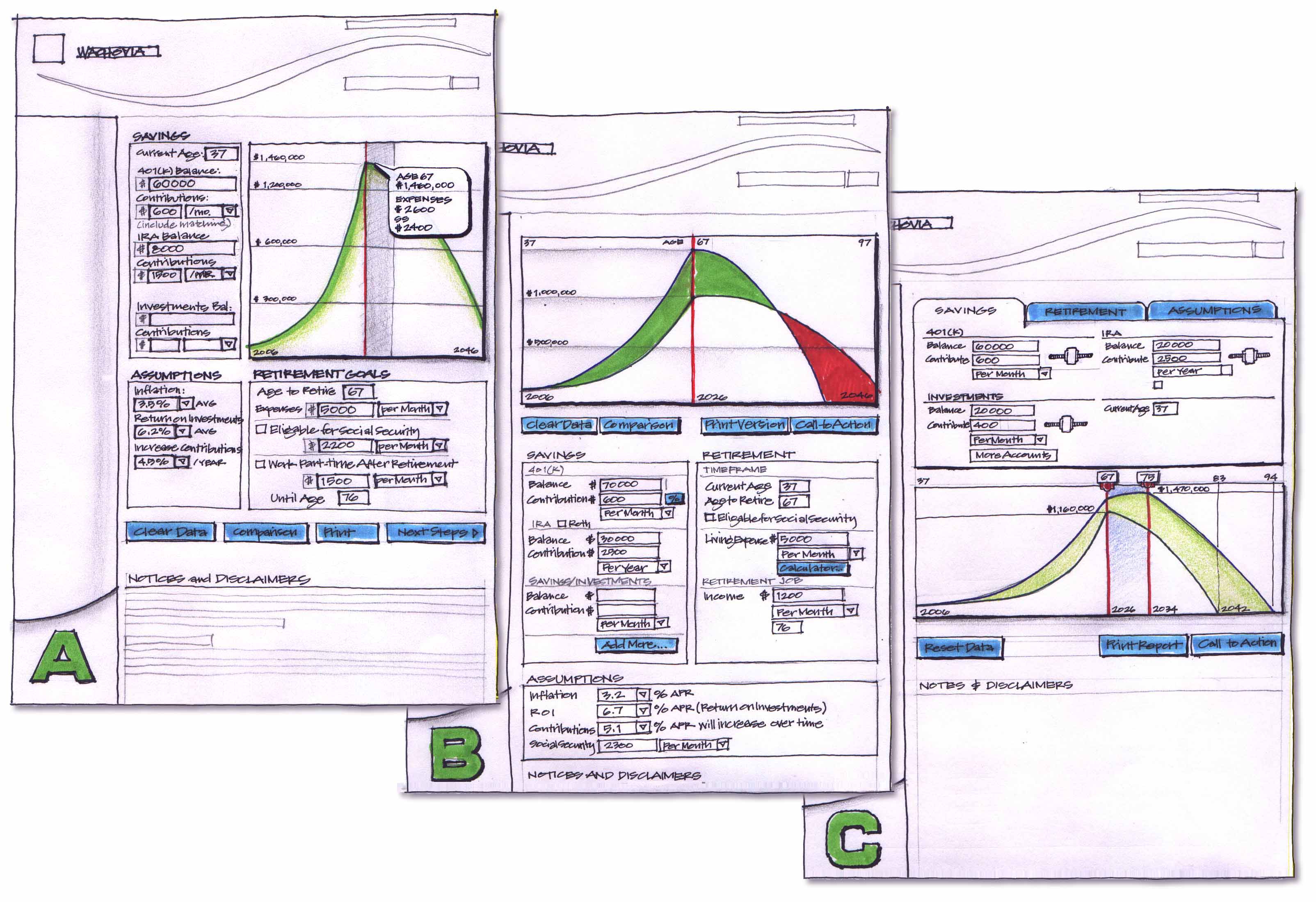
Wachovia - VP eCommerce: 2003 to 2007

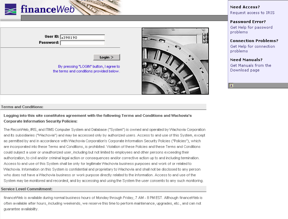
From a series of projects with an internal IT team dedicated to the Finance Department.
Projects included web-based reports builder with dynamic XLS output, and a replacement reconciliation engine with web-based rules creation and editing.
(HTML/JS/CSS mockup)
Internally-developed PHP-based tool for managing web design and production.
Starting as a functional but unattractive mess with many specialized screens, interviewed users and developed a priority list of issues, then went straight at the forms through HTML mockups for testing and approvals.
We merged functions to eliminate half the old views, actual changes took a week to implement.
(HTML/JS/CSS mockup and PHP edits)
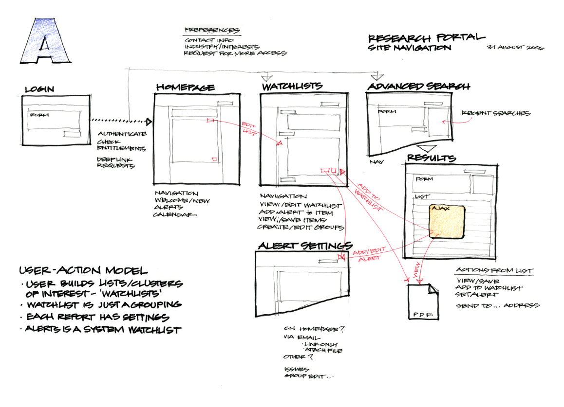
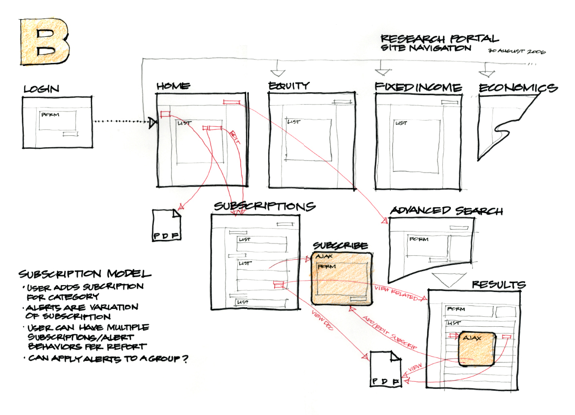
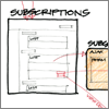
Workflow diagrams for new research portal showing alternative behaviors, part of a larger series of concepts.
Users search to add sections to their watchlist/reports page.
(below) Concept B
Subscription model where users could add alerts for automatic updates delivered via eMail.
(Ink and colored pencils)
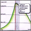
Initial concepts for user and stakeholder feedback. Sketches produce better early feedback because participants understand that the ideas can still be easily changed.
This project was named in 2006 'Best Practice' financial calculator by analysts at Change Sciences Group
(Ink and colored pencils)
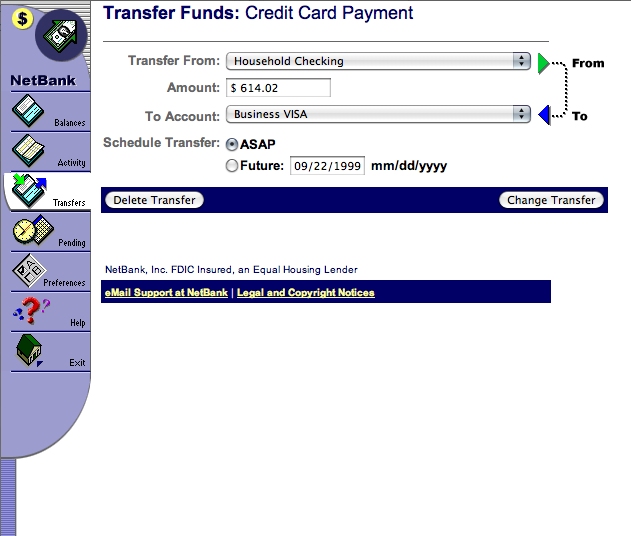
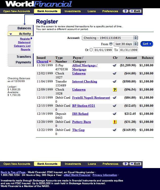
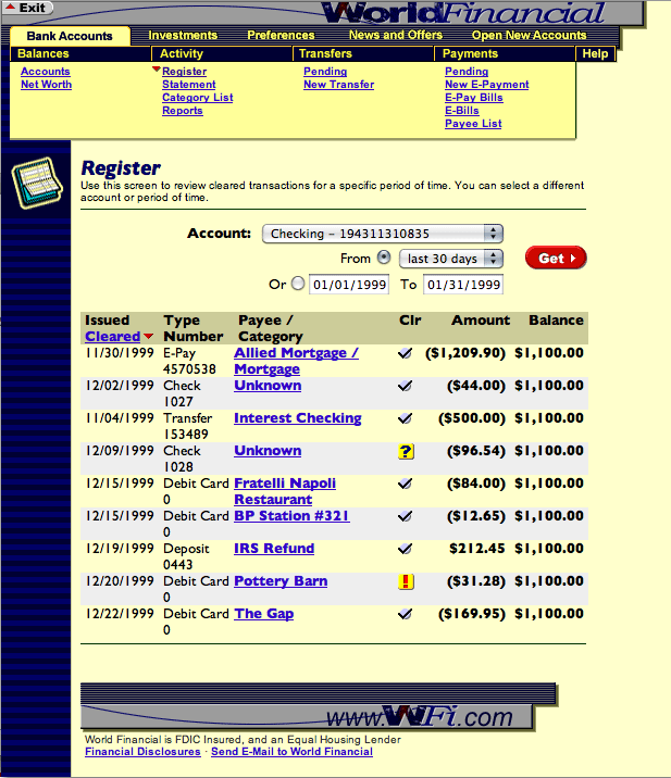
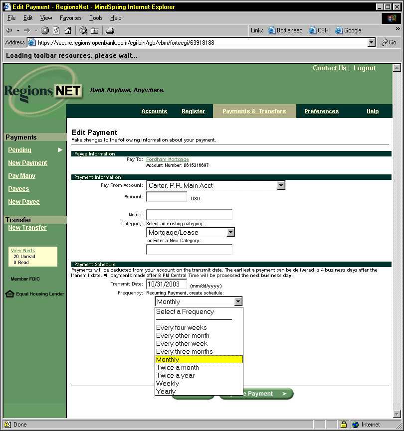
S1 Corporation - Chief Interface Architect: 1995 to 2003
By 2002 S1 powered over 3500 other internet enabled banks with seven product lines (and four complete technology re-writes). Interesting times.


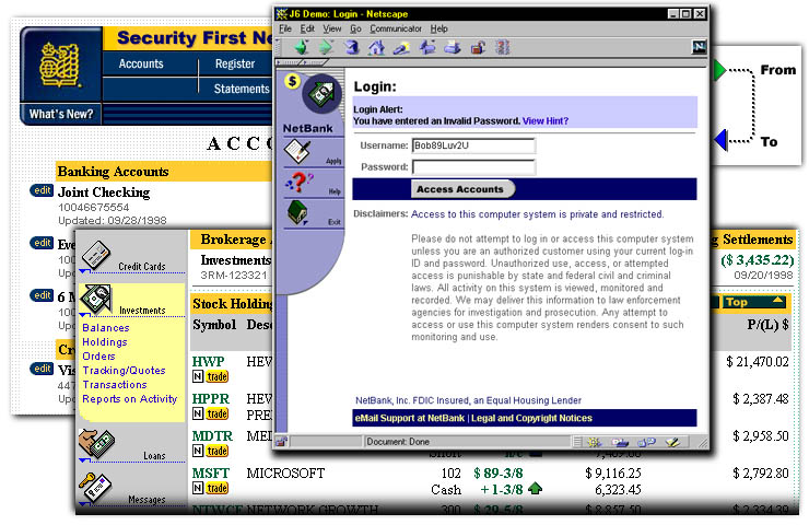
(Screenshots from early brand implementations)
Simplified 1998 banking product targeted for small banks and credit unions.
(Screen capture from HTML specification)
Side Navigation and custom buttons
Concept used to show customer banks the power of the page architecture and CSS classes.
(right) Top Navigation and custom buttons
CSS font and color controls with backup HTML coding in shared objects. Early use of 'mega-menus' in web application.
(below left) Corporate Banking used for demos
Derived from an early wireframe for user testing.
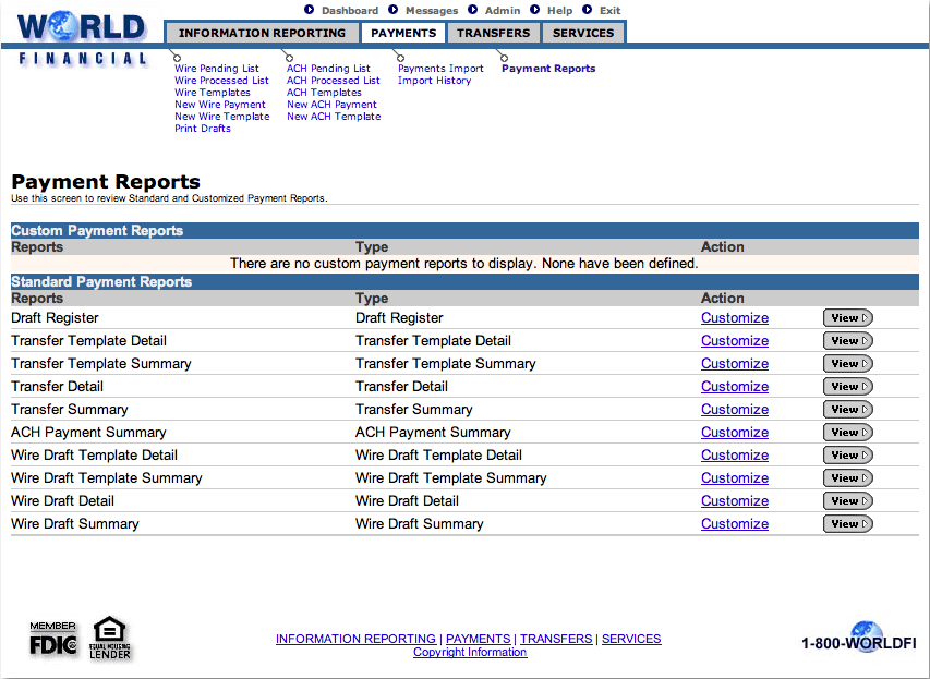
(below right) Regions Bank implementation on S1
Customer example of extensive branding applied with the S1 Template Object Model.
(Screen capture from live demo)
Top Navigation and custom buttons
CSS font and color controls with backup HTML coding in shared objects.
(Screen capture from live demo)
(Screen capture from live demo)
Example of extensive branding applied with the S1 Template Object Model.
(screen capture from production)
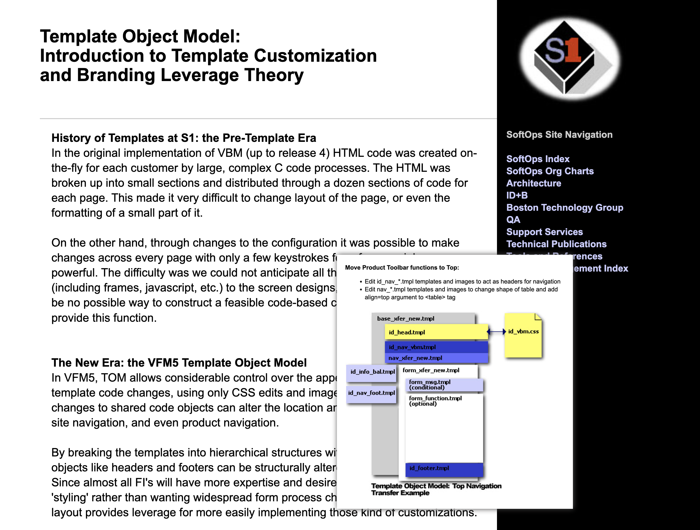
Introduction page with high-level description and block diagrams showing common transformations, 1998 HTML.
With CSS going through an unreliable transition while browser support unified, this page architecture used separate tables and HTML4 alignment arguments to change site presentation for individual banks.
Browser rendering resolution has changed - Smaller font sizes were used to work better on most computers and displays of that time.
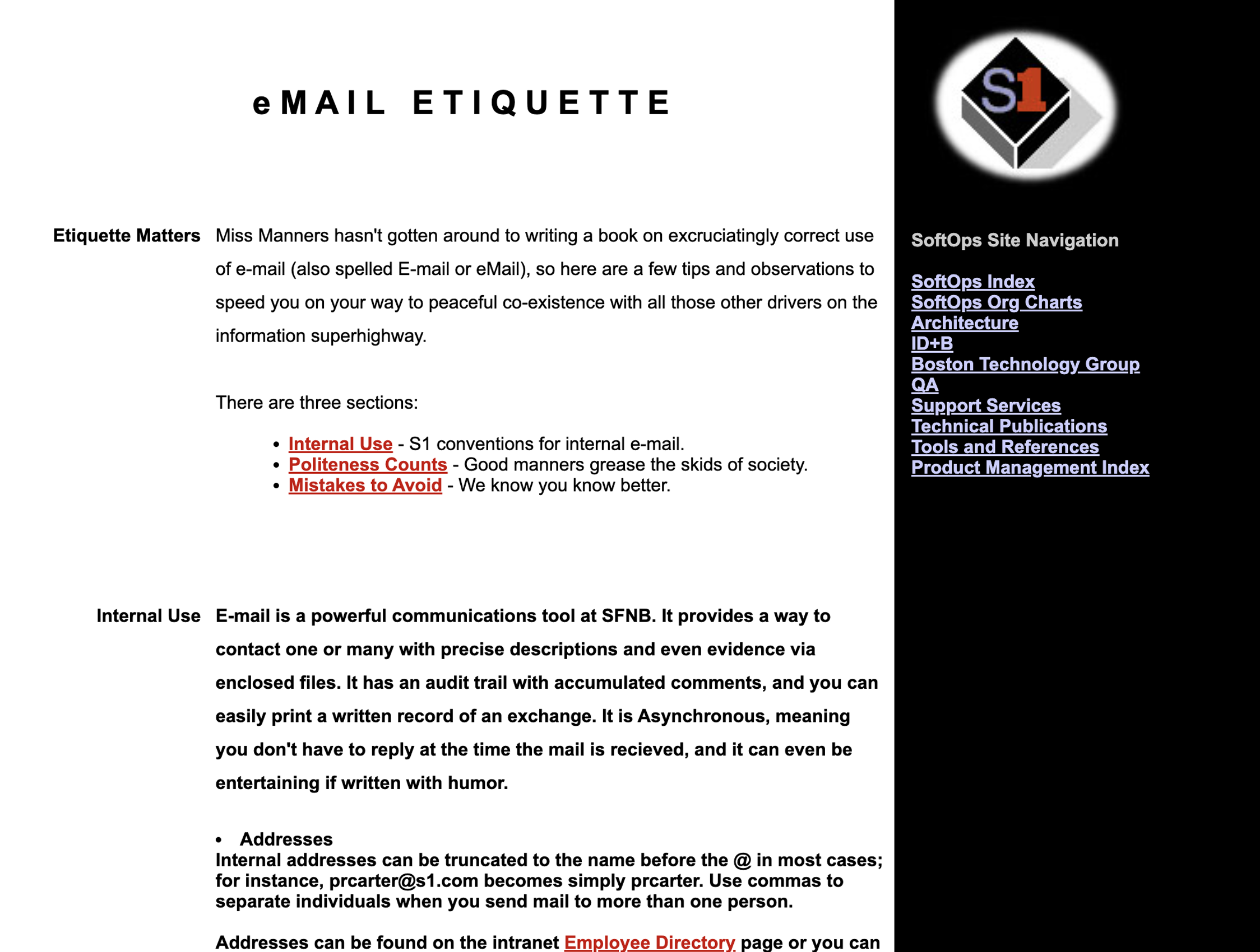
(below) Intranet eMail Page Example
(below) Internal eMail etiquette... circa 1998.
(Hand-coded HTML)
Internal eMail etiquette... circa 1998 (HTML).
Browser rendering resolution has changed - Smaller font sizes were used to work better on most computers and displays of that time.
(Hand-coded HTML)
Peachtree Software - Interface Architect: 1993 to 1995
To power feature analysis and prioritization, we used Contextual Inquiry with data from in-person customer visits. Peachtree also had an in-house usability lab for weekly tests. ADP purchased the company in late-1994 and merged their user testing into the lab schedule.

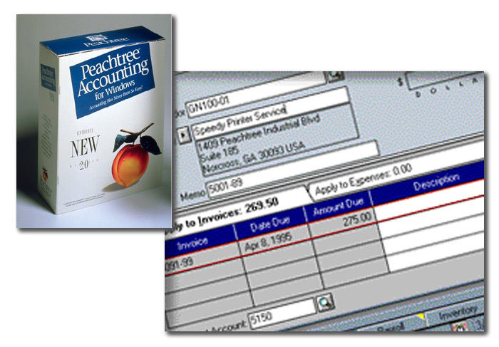
Defined functional requirements and look and feel, developed consistent process flow, led user research, including internal lab testing and contextual inquiry ethnography studies, also developed all icons and graphics.
(Product box and screenshot)
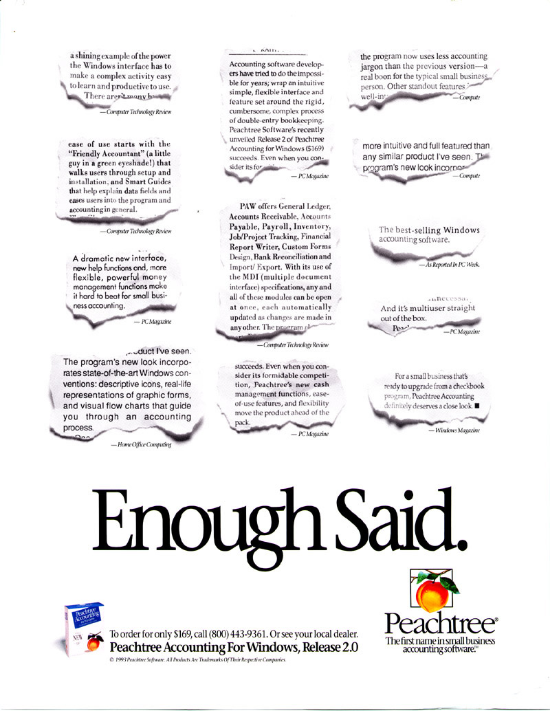
Features and ase-of-use were lauded in magazine reviews.
PC Computing "A dramatic new interface, new help functions and more powerful management make it hard to beat for small business accounting".
Home Office Computing "The program's new look incorporates sate-of-the-art Windows conventions: descriptive icons, real-life representations of graphic forms, and visual flow charts that guide you through an accounting process."
(Scanned magazine ad)
Peachtree awards became central to their advertising message.
1995 PC Computing "A" List, PC Magazine Editor's Choice, Windows Magazine Top 100 Award, Home Office Computing Editor's Pick for Peachtree Accounting for Windows 3.0
1994 Codies Award, PC Magazine Editor's Choice, Home Office Computing Editor's Pick Award for Peachtree Accounting for Windows 2.0
1993 Computer Shopper Best Buy, Accounting Today Top 100 for Peachtree Accounting for Windows 2.0
(Scanned magazine ad)
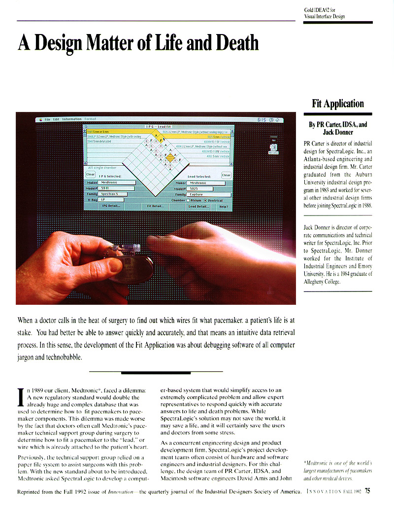
IDEA Award: Medtronic 'Fit' 1992
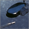
Developed as a consulting project for Medtronic phone support, it compares families of pacemakers and leads by classifying the combinations using simple icons. It's an early example of a stateless GUI that responds to inputs in any order.
Primary research was ethnography, sitting in with call-center nurses and asking questions between tasks. Alternate concepts were evaluated as paper prototypes, and code iterated through user testing.

Links to scans of articles from the IDSA magazine, Medtronic Pulse, and BusinessWeek.
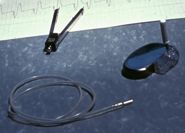
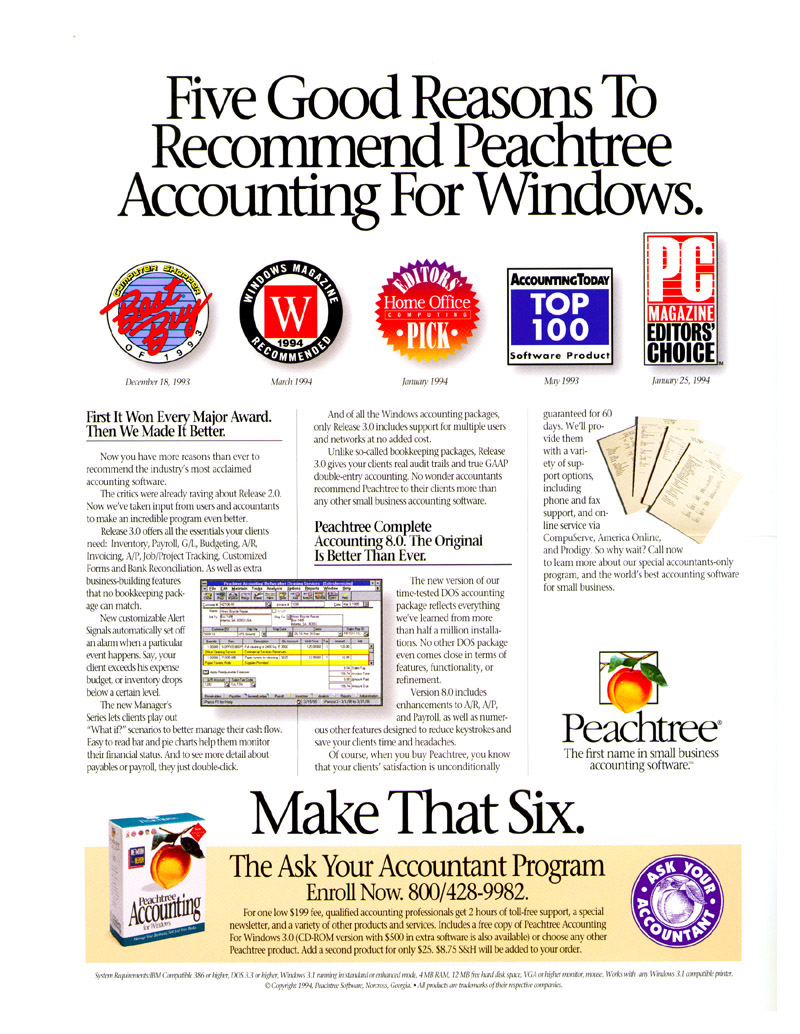
A titanium-cased pulse generator plus the silicone coated platinum electrical lead inserted into the wall of the heart.
When a pacemaker is replaced after four years of use, it is connected to the previously implanted lead.
With different designs for the lead connectors and many manufacturers resulting in over 1 million combinations - understanding which pacemaker and/or adapters to order was very complicated.
(Product photography)
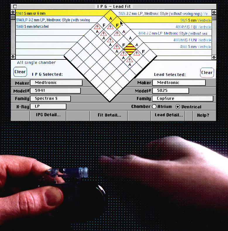
Allows modeless entry of identification data in whatever order a doctor calls out through dynamic menus and an X-Ray id search dialog.
Ethnography with the Medtronic technical support team was key to design of the quick and simple interaction.
(Macintosh software written in MacApp)
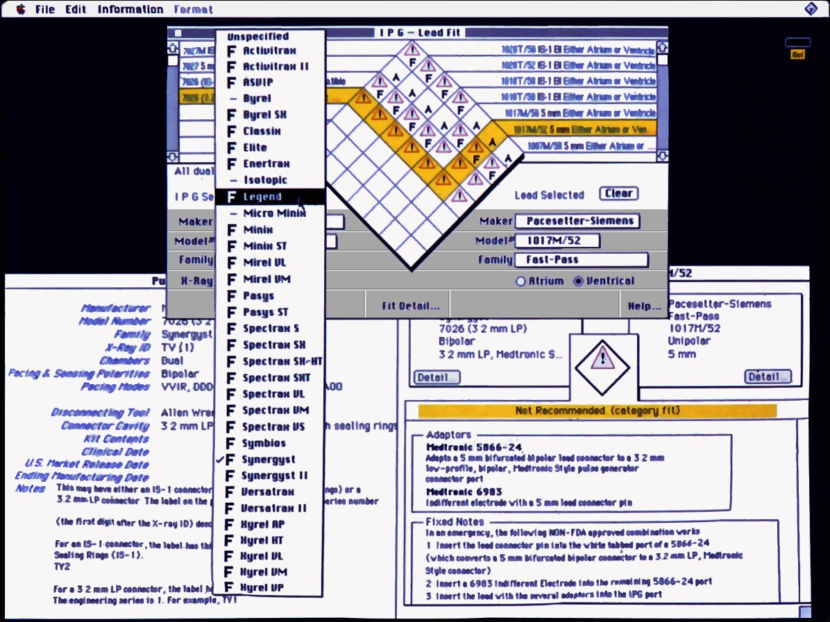
Simple indicators beside choices to quickly identify combinations without hiding other alternatives.
Once a selection is made, a click on the icon drills down to detailed information on the parts and their fit, including emergency procedures when there are no alternatives.
(Macintosh software written in MacApp)
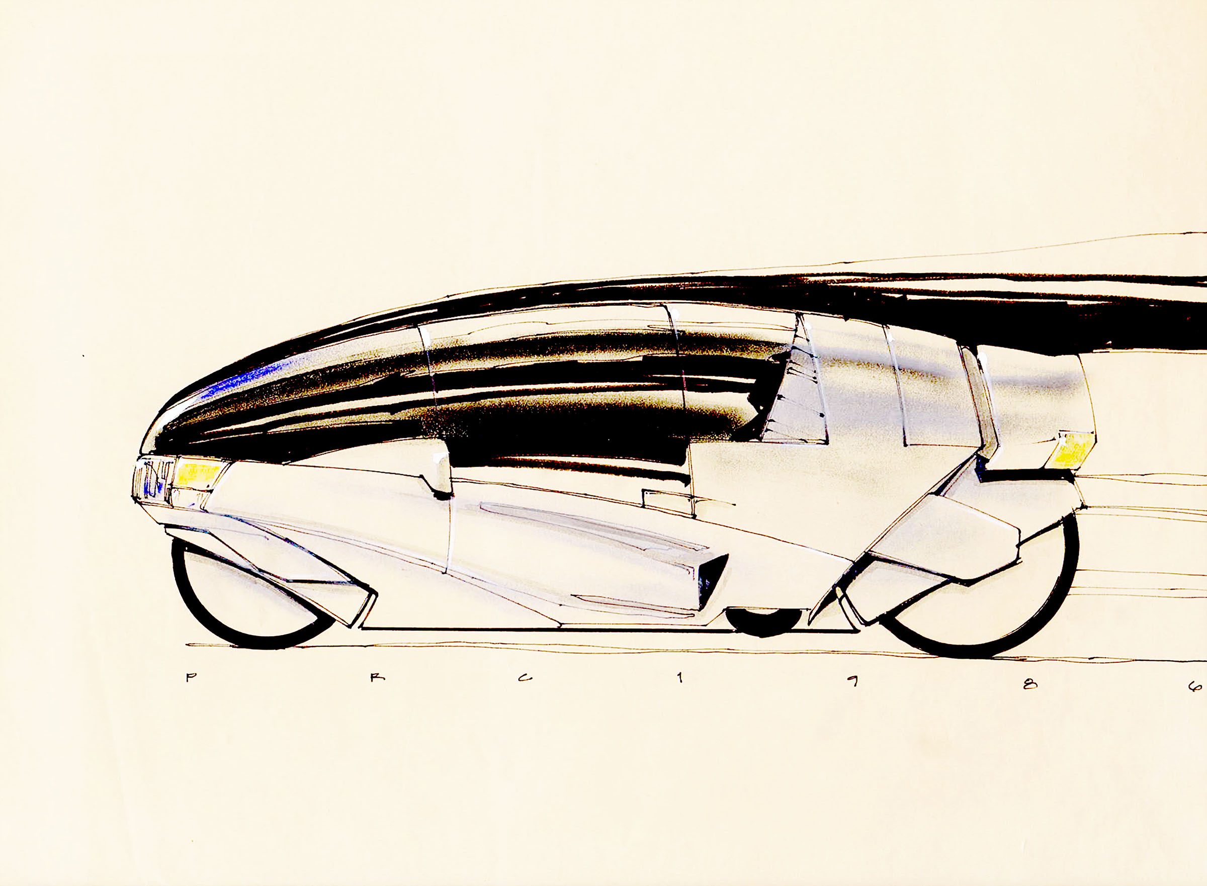
Industrial Design Consulting: 1983 to 1993
Design education focuses on user-centered methods, identifying needs, collecting and organizing information, building alternatives, evaluating and refining them, along with project management to hold it all together. It's a big set of tools and designers choose the a subset to best fit the needs of a project. Making things that are functional and beautiful takes a surprising amount of work!
Design methods can be applied to almost any complex problem; business schools have widely adopted the methodology as design thinking.


Proposal sketch in RFP response helped win the project.
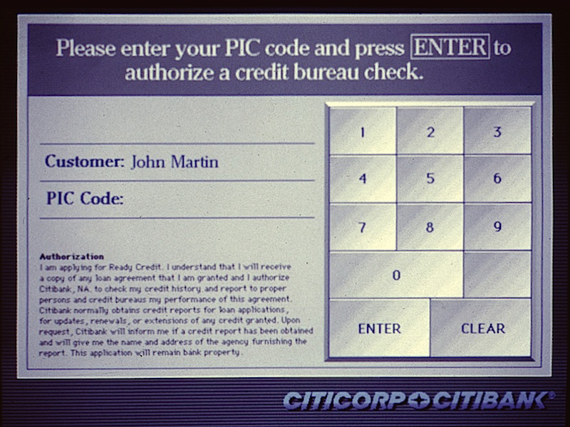
1989-1990 project to explore how to introduce data mining and targeted cross-selling technology into bank branches.
(Mixed-media renderings)
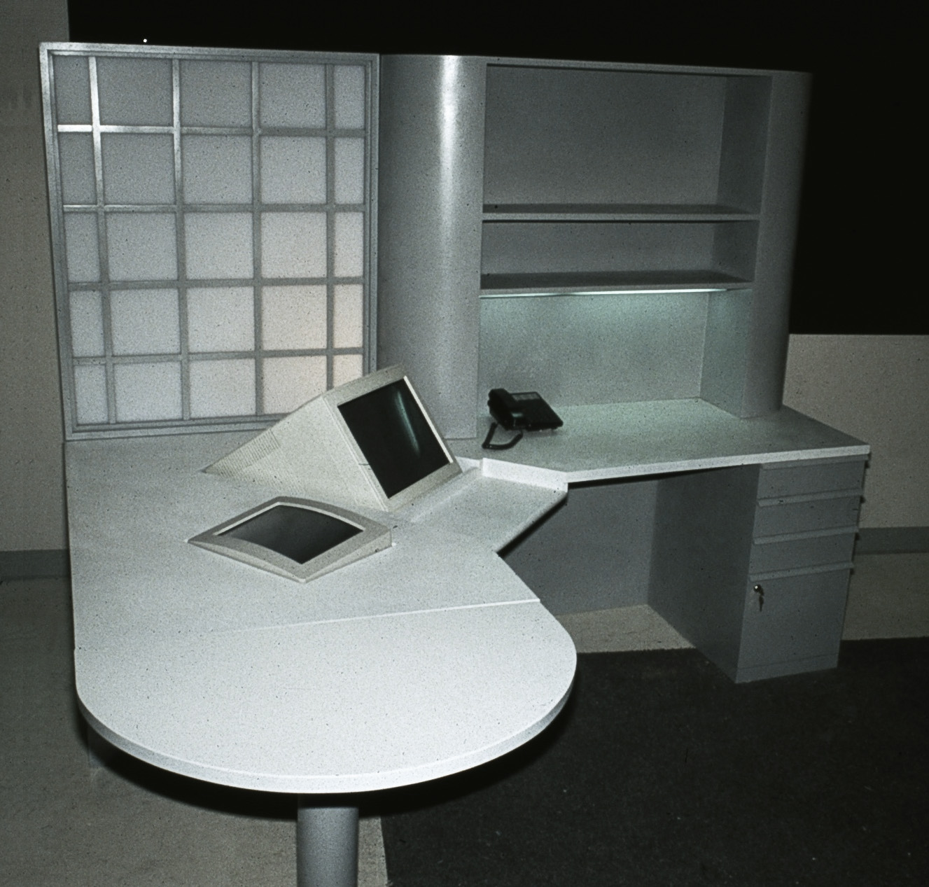
Furniture Design
Full-scale furniture with five different sizing and arrangements to test bank representative-to-customer scenarios.
(Wood and plastic furniture prototypes with embedded monitors and servers)
(right) Customer Display Software
One of the key ideas to evaluate was customer reactive to having a touchscreen
for information and approvals, this screenshot is from one of several iterations.
We also tested various media for communicating information, from simple text, to visual graphing, to animations and video in user tests run in three cities.
(Macromedia Director interactive mockup)
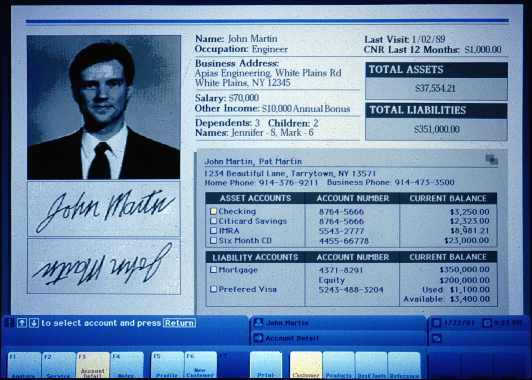
(below) Staff User Interface Screenshot
1989-1990 project to explore how to introduce data mining and targeted cross-selling technology
into bank branches, we built full-scale furniture and custom software to test CSR to customer scenarios.
Quantitative user tests used actors as customers to study staff experiences.
(Macromedia Director interactive mockup)
Quantitative user tests were run in three cities.
1989-1990 project to explore how to introduce data mining and targeted cross-selling technology into bank branches, we built full-scale furniture and custom software to test CSR to customer scenarios.
Quantitative user tests used actors as customers to study staff experiences.
(Macromedia Director interactive mockup)
Customer Software
One of the key ideas to evaluate was customer reactive to having a touchscreen for information and approvals, this screenshot is from one of several iterations.
We also tested various media for communicating information, from simple text, to visual graphing, to animations and video in user tests run in three cities.
(Macromedia Director interactivemockup)
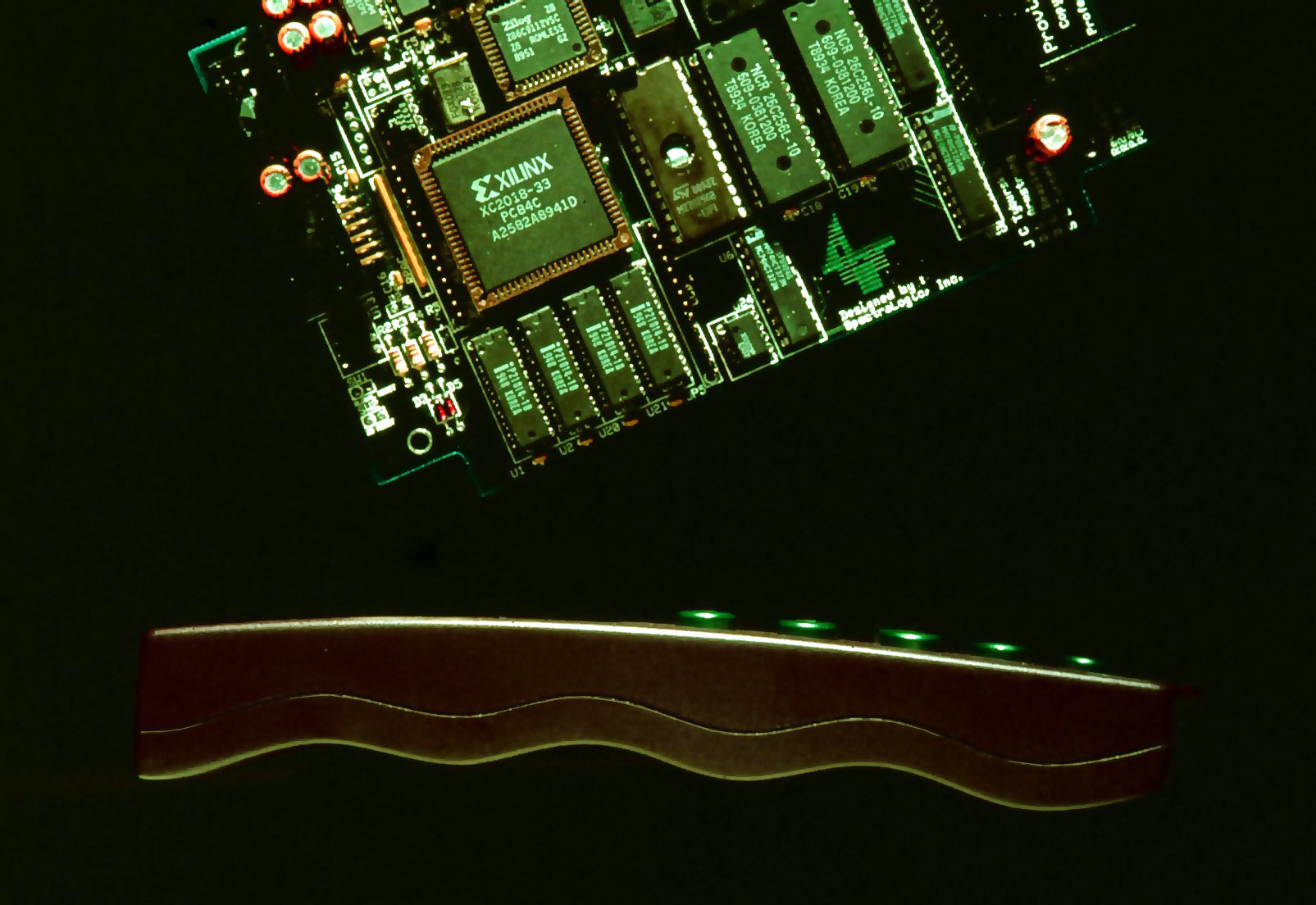
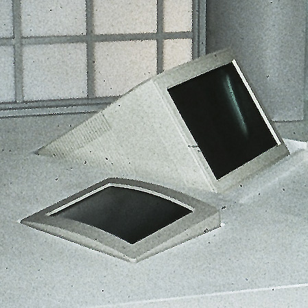
Prototype PC board and solid enclosure mockup for a 1988 training system.
(Wood and plastic model)
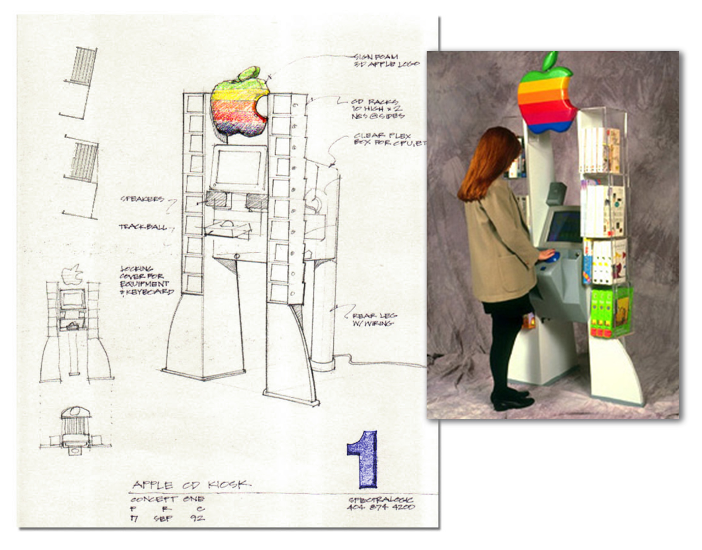
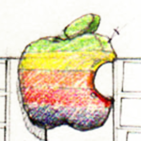
Apple wanted a distinctive interactive retail point-of-purchase display for marketing Mac-compatible CD-ROMs in computer and software retail stores where floor space was at a premium.
This design featured a self-contained Mac demonstration system with a custom graphic interface and an oversized trackball, but no keyboard, housed in a locking clear acrylic housing.
The display had clean shapes and adjustable shelves to fit a variety of CD packaging. The footprint was designed for placement at the end of an aisle, as a standalone unit, or in a corner.
(Design concept, prototyping, Macintosh demo software for trackball)
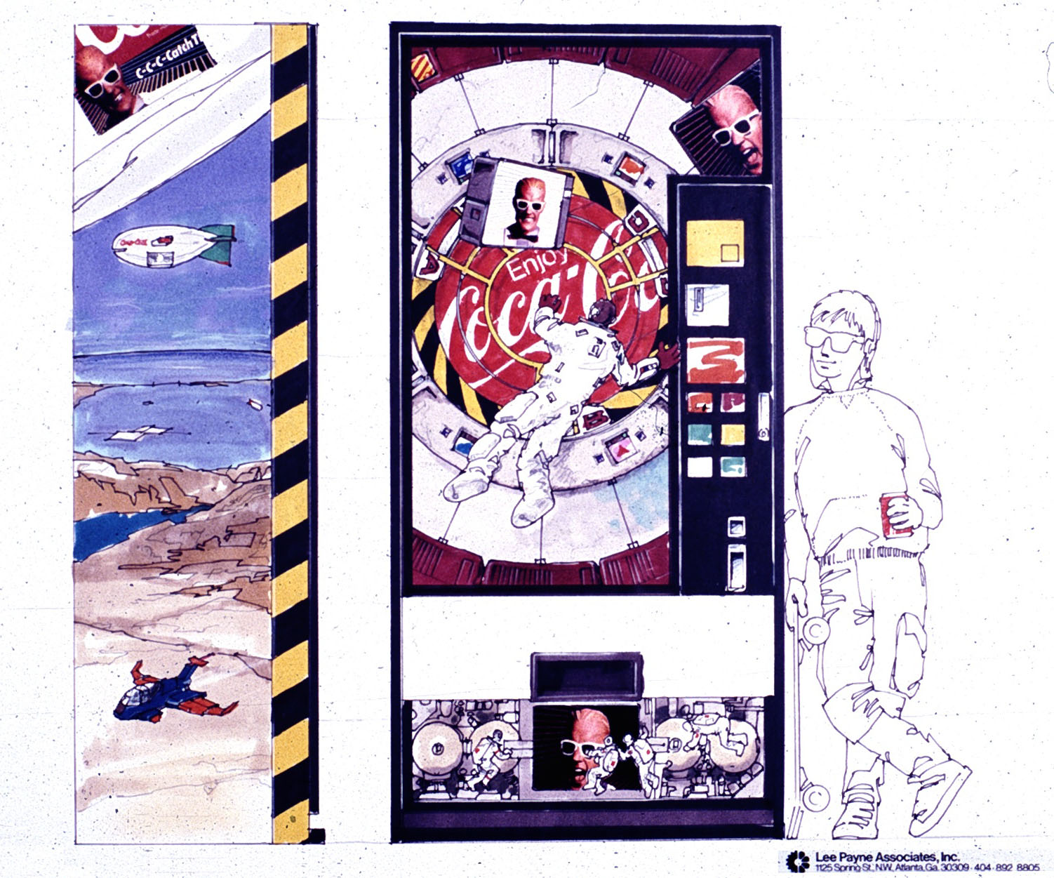
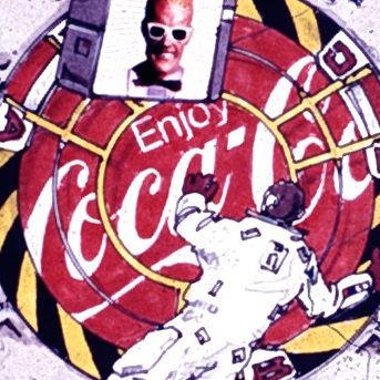
Design brief was for graphics to be used in High Schools and Middle Schools to improve sales of Cherry Coke.
(Mixed-media rendering)
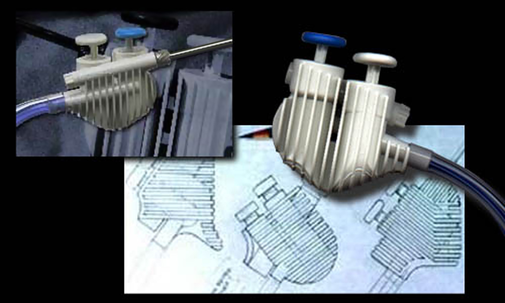
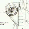
Development sketch and production unit for a disposable surgical instrument for minimally-invasive gall bladder (Endoscopic Laparoscopy) surgery.
Handpiece controls suction (white button) and irrigation (blue button) with a cauterizing Bovi probe inserted through the stainless canula via a self-sealing valve at the back. Hoses exit through the back to reduce tangling.
Design goals were superior handling, easy control differentiation via color tactile cues and a reasonable production cost.
After initial sketches wood handling models were used to evaluate handling with doctors and surgical technicians, more models were used to work through manufacturing issues and develop the final design.
Steven Braun of SpectraLogic took over the majority of engineering and followup design work
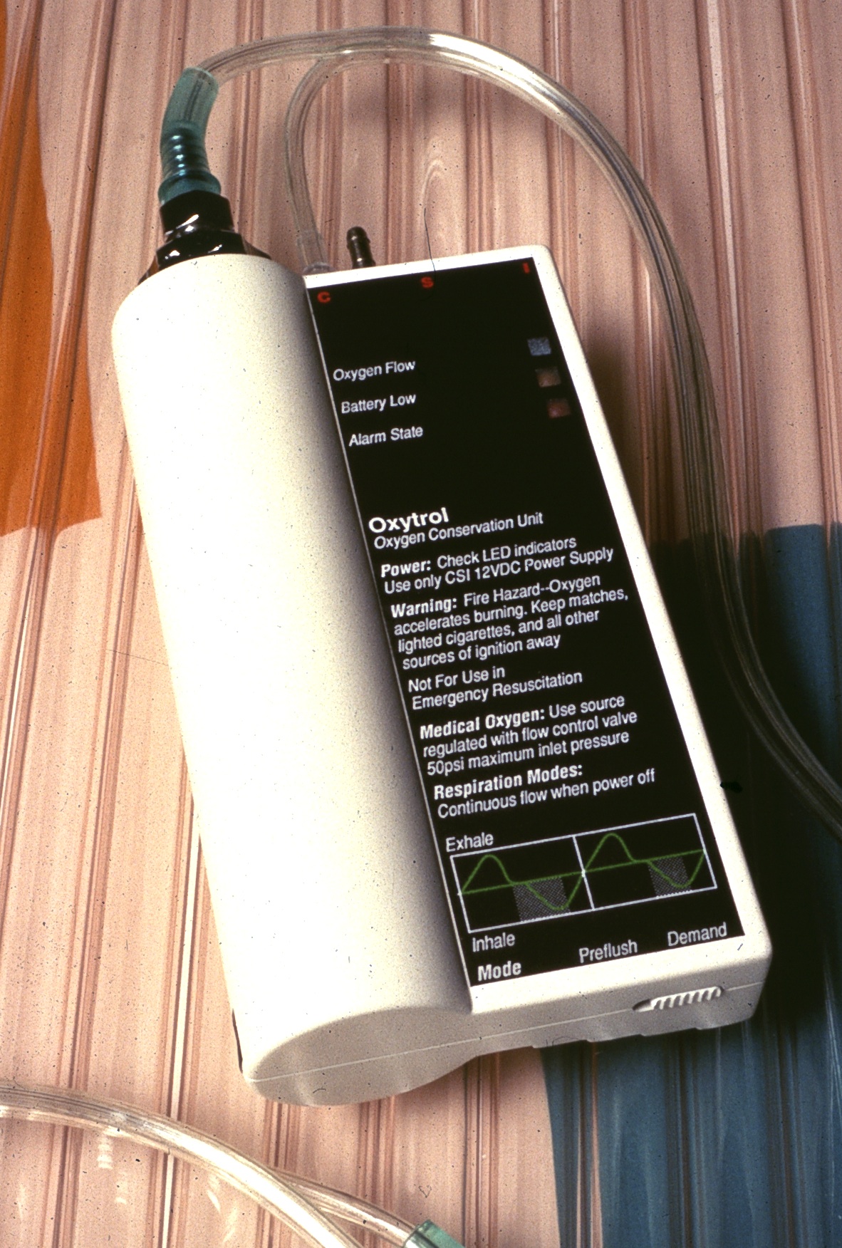
Unique oxygen conservation system based on a sensitive flow sensor circuit developed by SpectraLogic cuts the amount dispensed by up to 60 percent, and saves nasal tissue from irritation
Designed to be used by a primarily geriatric market, the controls were simplifed and state displays were both visual and audible
The shape makes the unit easier to grip and carry. A threaded boss and belt hook on the back made the unit simple to mount.
(Solid case mockup - wood, plastic, paint, dry transfers)
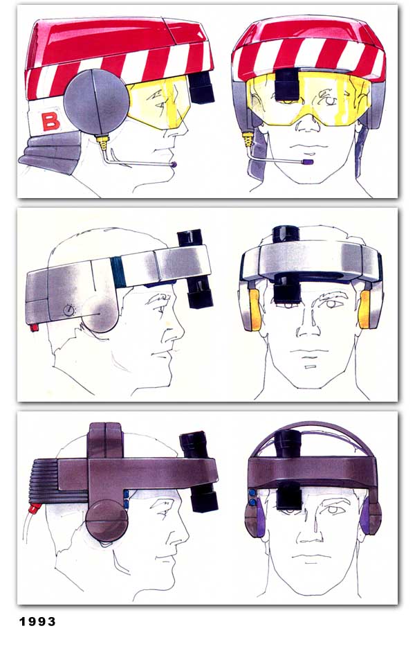
1993 project for a UK-US defense contractor developed a belt-mounted CD-ROM and carrying system for a personal HUD, to be used for access to aircraft data, schematics, and repair procedures used in maintenance.
Four prototypes were constructed from development of the bottom concept
(Mixed-media sketches)
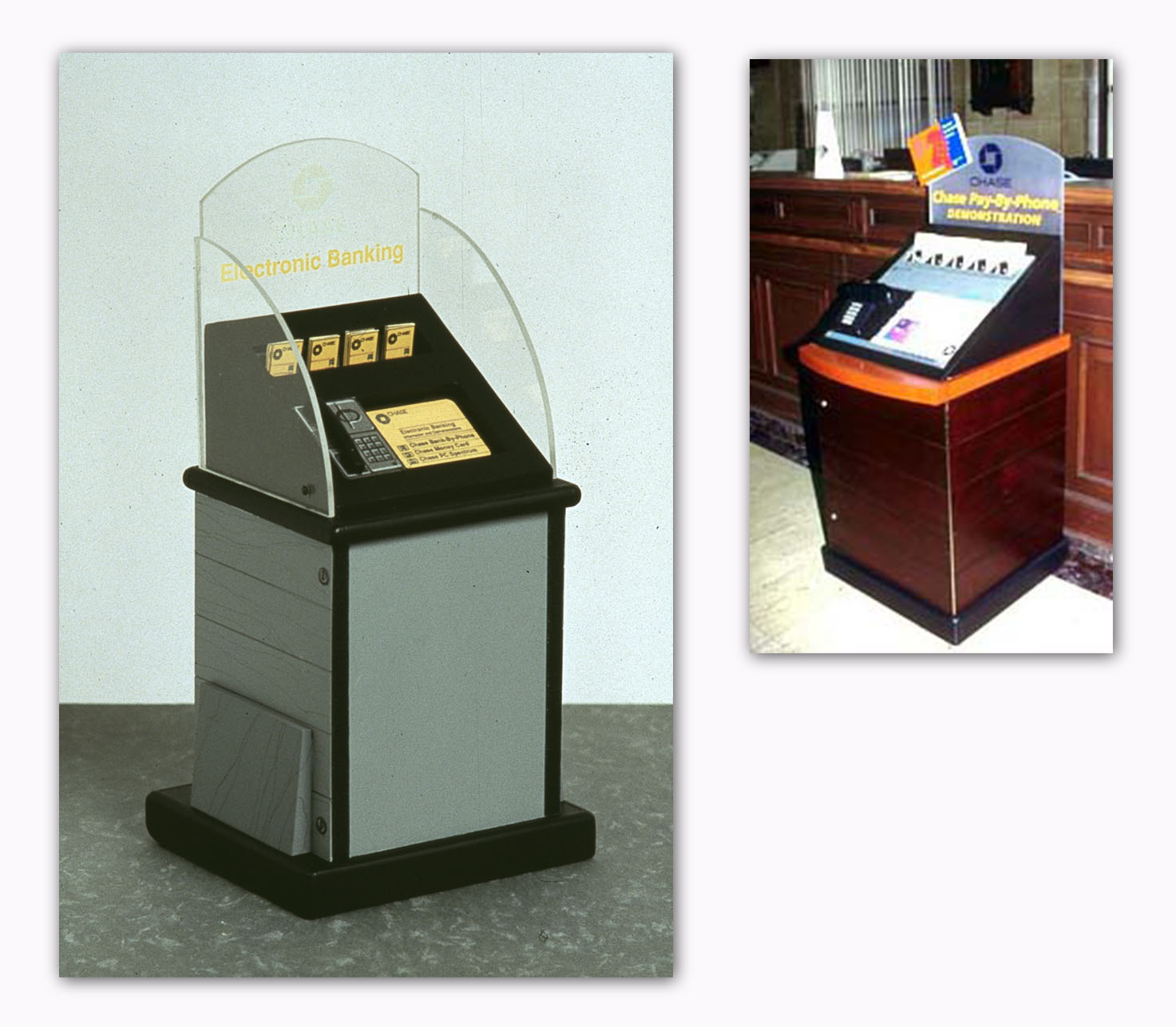
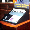
1992 standalone system was designed to show bank customers ease-of-use of the Chase touchtone phone-based bill payment system, and improve usage.
The kiosk held a 486 PC with a soundcard; a simple reference flip guide shows the commands. Guide furniture was designed so the print guide could be replaced with a touchscreen in later versions to cover all of the bank's product lines.
The furniture-inspired shape was designed to blend into the variety of interior styles in Chase branches. It was equipped with rollers on the back edge for easy repositioning, and had lockable storage for marketing collateral.
(Scale model - plastic, paint, paper and markers)
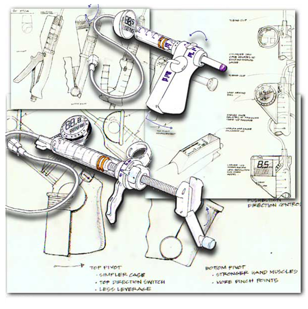
For balloon angioplasty procedures, this design featured a digital pressure indicator.
A variety of actuation methods for controlling the pressure were developed and tested.
(Pencil and mixed-media sketches)
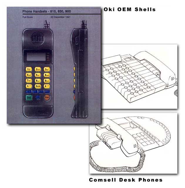
Oki Telecom: 800 Series Cases
After several years the rapid evolution slowed and we were able to develop
multiple case designs for OKI to build custom phones for carriers.
This image also shows some early SIP-based office phone concepts for Comsell.
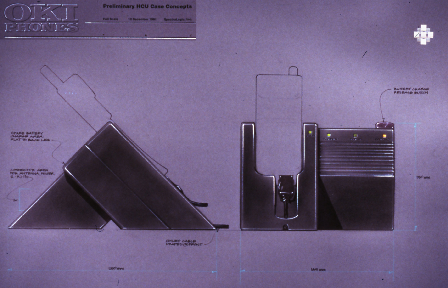
(below) Oki 900 Cellphone Charging Stand
Smaller cellphones and shorter earlier battery life, increased the need for
well-designed charging stands that supported use as a speakerphone on a desk or table.
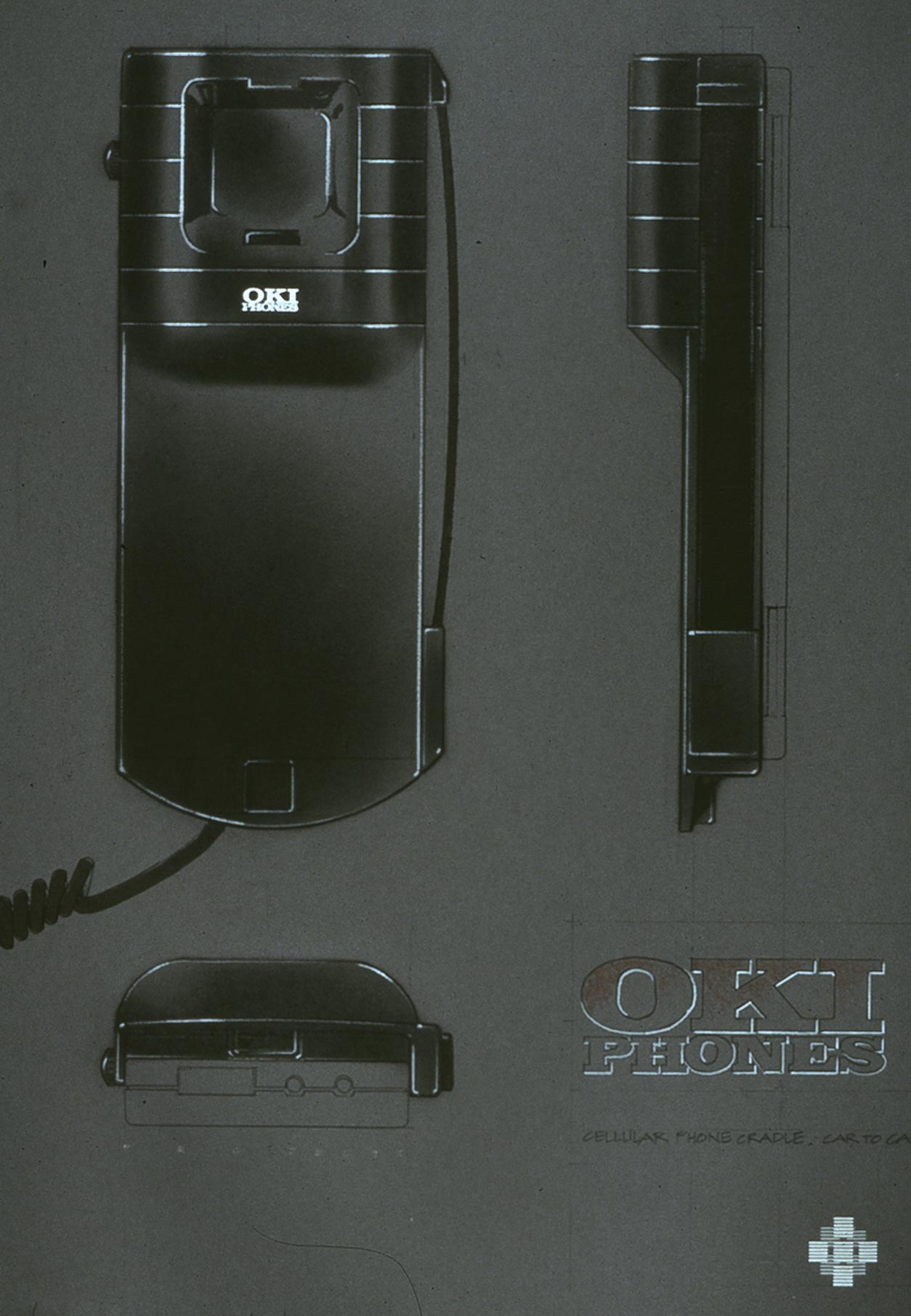
(below) Plate Phone Concepts
Plate phones were heavy encased metal car phones adapted to carry around.
The case in this design covered the metal box and held a receiver attached by a cord, it would have been used inside a bag with a large battery underneath that was also part of the project.
Early 1990s cellphone development as they went through the evolution from heavy bag phones to multi-board digital spread spectrum designs.
(Mixed-media sketches with dry transfer logos)
As cellphones became smaller battery life suffered, increasing the need for well-designed charging stands that supported use as a speakerphone on a desk or table.
(Mixed-media sketches with dry transfer logos)
After several years the rapid evolution slowed and we were able to develop multiple case designs for OKI to build custom phones for carriers.
This image also shows some early SIP-based office phone concepts for Comsell.
(Mixed-media and ink sketches)
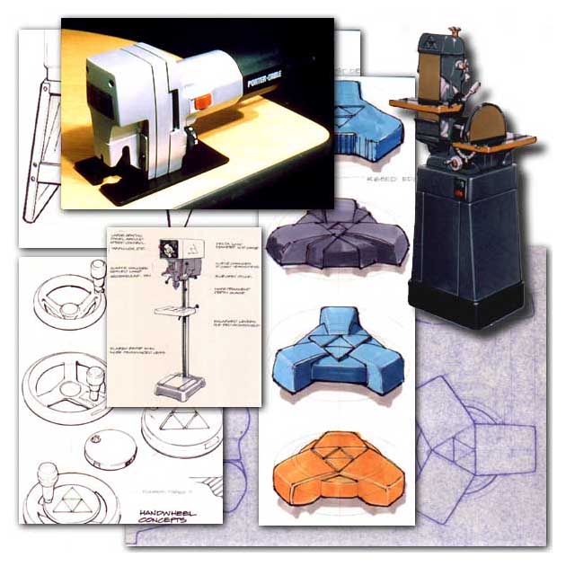
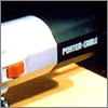
Line redesign for Delta's woodworking shop tools, and Porter-Cable jigsaws and heavy routers, 1984-1988.
(Mixed-media and ink sketches, product photography)
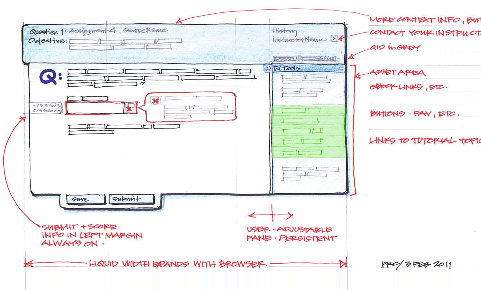
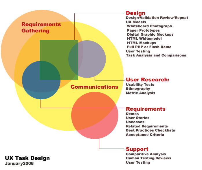
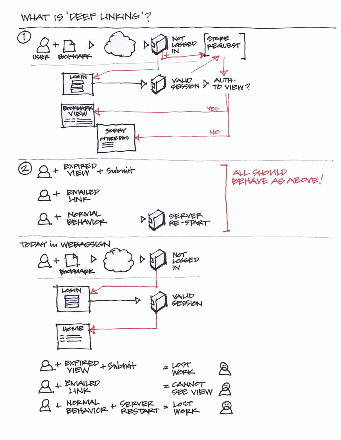
Communications: Diagrams, Docs, and Explanations


(Adobe Photoshop)
(Adobe Photoshop)
(Ink and pencil sketch)
Optimized for dial-up use with next page images pre-fetched as 1x1 pixel dots along bottom of layout. Page layout via tables with in-line arguments... Looking back at this makes me very happy for modern semantic HTML!
(Hand-coded HTML)
Last section!
- Eva Pfiel, Ph.D
At some point we all have to wrestle with the limits of reality! If you have a great idea, you need to present it in a strong way so it has the best chance to succeed.
A corollary is don't iterate ideas in a different material or system. If it's a wood chair, we should design and prototype using wood. If it's a web page, move away from 'loren ipsum' and work with the actual words and images as early as possible!
(Mixed-media: pencil, pen, marker, pastel, and white-out on cotton paper)
Design Portfolio: Phillip Randolph Carter